3 systems where the craft itself is the deliverable, defined on this page from the real production vectors and rendered live in code: an editorial identity with a logo I drew and shipped, a design system whose tokens read like a language, and a brand identity built from 1 spiral.
The identity system for an editorial platform redesign. I drew the logo, named the palette, and built the component language the platform ships on. The vectors are verbatim, and every component below is rebuilt live in code, 1:1 from the working file.
ScopeLogo design and exploration · Color system and usage · Typography · Component language · Shipped platform
The shipped mark · Verbatim vector
Logo anatomy
Hierarchy in 2 colors
FRCC · Institution · WhiteNEWS · Product · Gold
1 line, 2 words, no container. The color split does the work a badge used to do: the institution recedes, the product speaks.
Clearspace and the stripe
X = cap height, all sidesStripe ratio 34 · 27 · 20 · 14
The 4 color stripe is part of the mark, not decoration: it always sits at wordmark width, and its bands are the category system.
The road to minimal
The identity started loud: a howling wolf badge in multiple lockups, container shapes, and stripe placements. The shipped logo keeps only what earned its place: the letterforms and the stripe.
2 of the wolf badge explorations, verbatim vectors. Strong marks, retired on purpose: the wolf stayed in the brand story, the wordmark carries the product.
Color · 5 colors, 5 story pillars
Navy#243269
Gold#F2B41C
Sky#8FBAC8
Lavender#D6D5E0
Rust#8D2B01
Every color is a story pillar. Gold: College Excellence. Sky: Vibrant Culture. Lavender: Transformational Partnerships. Navy: Learning Without Limits, and the structure everything stands on. Rust: Success for Every Learner.
Typography · The faces in the file
Display · Acumin Pro Cond Black · 70Front Range, in the news.
Headline · Acumin Pro Cond Bold · 40A headline carries the card.
Card title · Roboto Bold · 20Nibh in dolor bibendum.
Body · Roboto Regular · 18Body text runs long and stays readable.
UI and buttons · DM Sans Bold · 16SUBSCRIBE · VIEW ALL · BROWSE
Acumin Pro Condensed is licensed through Adobe Fonts; specimens on this page stand in with Roboto Condensed. Roboto and DM Sans render as themselves.
Component language · Rebuilt live, 1:1 from the file
The design system behind an AI support platform, defined live on this page: 1 language of color, type, and components that lets a staff member read the state of any request at a glance. The signature move is the confidence and AI token set, and the system runs in production.
ScopeColor roles and tint tokens · Ten step type scale · 9 component families · Confidence and AI badge language · Production platform
85%Confidence line, drawn in the UI
3Status states, 1 badge language
10Step type scale
Color · Roles and tint tokens
Ink#1A1813
Accent#CF4D28
Positive#1A854A
Caution#B56B1C
AI#6F52D4
Surface#FBFAF8
Auto-routed
Every status color ships with a 12% tint token, so badges read clearly without shouting. Green: cleared the confidence line, routed automatically.
Needs review
Amber: below the line, held for a person to decide. The tint keeps a full review queue calm instead of alarming.
AI assisted
Purple marks every point where AI assists, so oversight stays visible. No purple, no AI: the rule holds across the platform.
Ten step type scale · 6 shown
Display · 44pxRequest routed to Financial Aid
H1 · 32pxRequest routed to Financial Aid
H2 · 24pxRequest routed to Financial Aid
H3 · 19pxRequest routed to Financial Aid
Body · 15.5pxRequest routed to Financial Aid
Label · 12pxRequest routed to Financial Aid
9 component families · Rendered live, not screenshotted
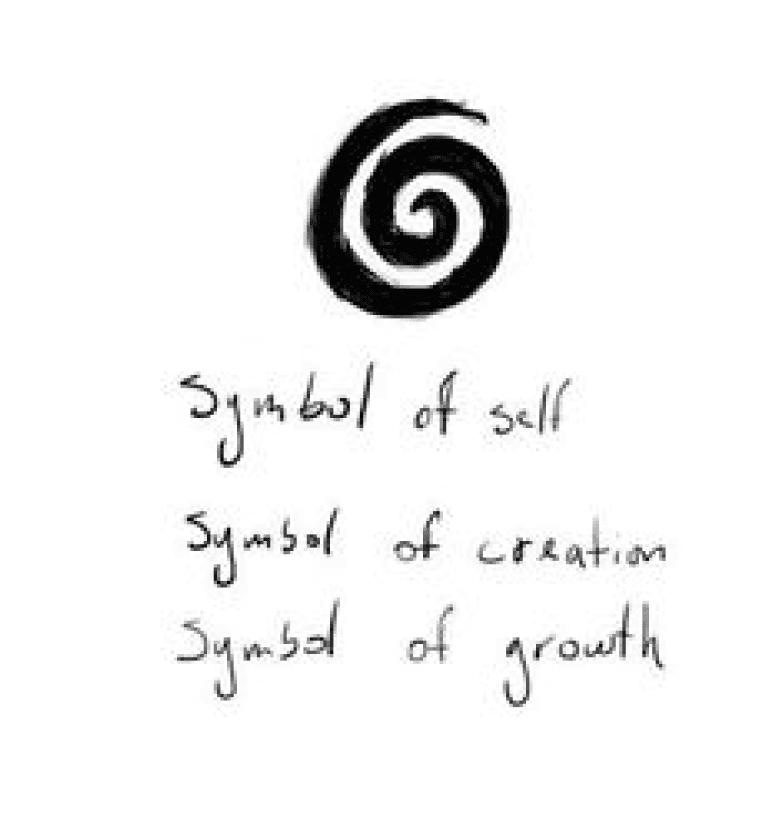
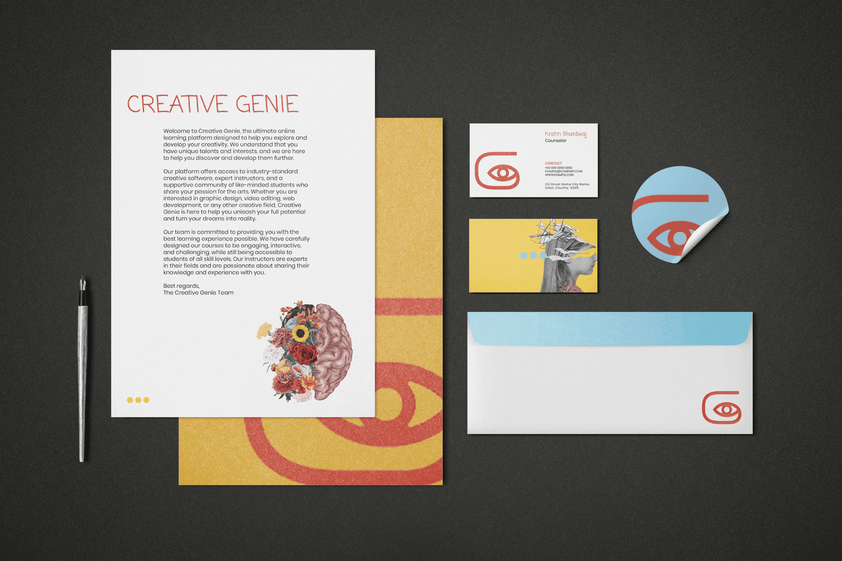
A brand identity for an online creative learning platform for K-12 students. The spiral mark carries the whole idea, so the identity was built outward from it: 1 shape, 3 meanings, and a collage system where creativity literally grows out of people.
ScopeLogo and identity system · Color and type · Illustration direction · Applications
Your Future, Your Canvas
The spiral, 3 ways
Self discovery, creation, and growth: inward to find your own voice, outward to share it. 1 shape carries all 3 meanings, so the mark never needs explaining twice.
Self
Creation
Growth
Construction
Rounded square spiral, eye on the optical middle, stroke constant at 11 units.
Clearspace and scale
The exclusion zone is 1 eye height on every side. The mark survives to favicon scale.
Color · Primary triad
Genie Red#DC3E25 · The mark, the CTAs, the highlights.
Sky Blue#97D5EE · Grounds every layout the red plays on.
Sunbeam#FDD803 · The spark, used sparingly.
60 paper · 30 sky · 10 red. A secondary ramp exists only for illustration and campaign work.
Typography · The odd couple
Coming Soon
Display · Handwritten warmth for a brand about beginners.
Poppins
Body · Geometric clarity that keeps the handwriting honest.
In the world
A K-12 student should look at this brand and think: I could make something. Everything above serves that 1 reaction.