
From an Unfiltered Feed to an Editorial Platform: Redesigning FRCC News Around Reader Mental Models
FRCC News is the institution's primary storytelling and brand-building channel, serving 44,700 annual visitors across the multi-campus network. The platform ran as a single unfiltered feed with no functional information architecture, weak metadata, and low-visibility CTAs, so stories were published but rarely found, sessions averaged 1.36 minutes, and 98% of traffic came from new readers with almost no return behavior.
As Lead Product Designer for this project, I led the ground-up redesign of the editorial platform: product strategy, UX research, information architecture, visual design, prototyping, testing, and developer handoff.
I audited the existing feed, mapped how four audience groups actually looked for stories, and rebuilt the platform on a dual-navigation architecture, a brand-aligned design system, and templates that turn readers into subscribers.
How might we restructure FRCC News so 44,700 annual readers can find, browse, and act on stories, while the platform serves both reader mental models and the college's strategic communication goals?
I redesigned the editorial platform end to end, lifting task success from 54% to 91%, navigation comprehension from roughly 40% to 92%, and successful filtering from 22% to 86%, while cutting time to find an article by about 70% and navigation misclicks by 60%. Ease of use rated 4.4 of 5 with dead ends near zero. AI-assisted prototyping compressed design-to-production from 8 weeks to 3, and the redesign won the 2025 NCMPR Medallion Award.
Task success rate rose from 54% to 91% across the core reader tasks.
Readers who correctly understood each top-level category rose from roughly 40% to 92%.
Readers who successfully refined results using filters rose from 22% to 86%.
Average time to find a relevant article fell by about 70%.
Navigation misclicks fell by 60% in testing.
AI-assisted prototyping compressed the design-to-production timeline from 8 weeks to 3.

Before and after: user flow evaluation
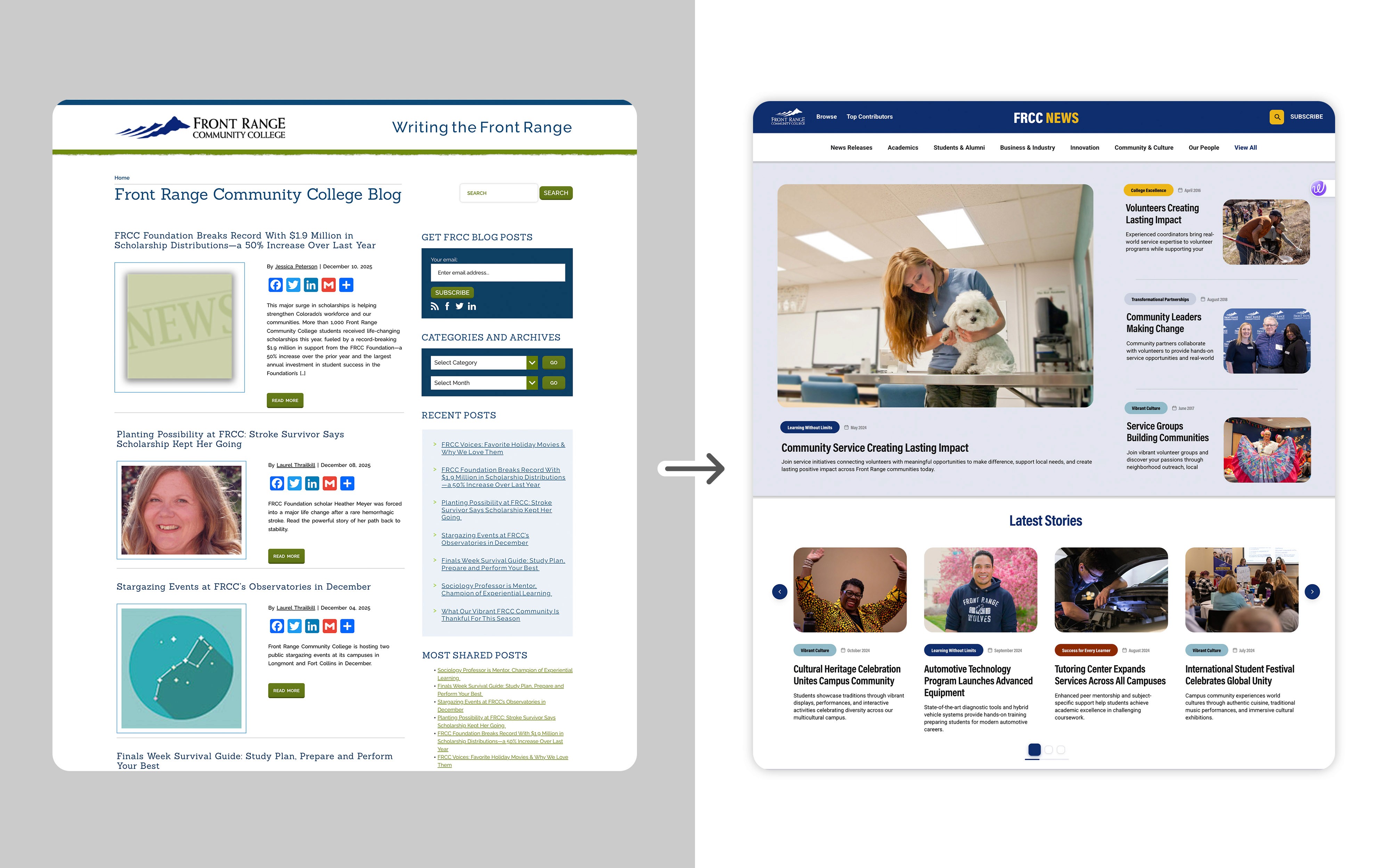
Before and after redesign
I led end-to-end design, from product strategy and research through prototyping, testing, and developer handoff. Conversations with the project sponsor, marketing leadership, and the EVP of Communications clarified strategic priorities: connect every story to FRCC's strategic plan, increase content relevance across audiences, and grow an underutilized subscriber base.
I worked with the steering committee to prioritize features. We had to balance the College's strategic goals against development constraints. A key tradeoff was feature complexity vs. timeline: stakeholders wanted robust category and tag systems and accessibility compliance, but we agreed to focus first on the elements that would have the greatest impact (core navigation, essential CTAs, and content templates), while deferring more advanced search or personalization to later phases.
I compressed the design-to-production timeline from 8 weeks to 3 weeks by integrating AI-assisted prototyping into the design workflow, enabling engineering to complete the first development cycle without clarification gaps.
Read the full handoff story on Medium ↗
Decision-making rationale
User research process & plan
To ground the redesign in real user and institutional needs, I conducted stakeholder interviews and user research before moving into design.
Conversations with the project sponsor, marketing leadership, and the EVP of Communications clarified strategic priorities for the platform.
Interviews with Prospective Students, Current Students, Contributors and Authors, and Senior Stakeholders, translated into actionable personas.
44,700 visits last year, with sessions averaging 1.36 minutes and mostly single-page, and 98% of traffic from new readers with little return behavior.
Audited the existing feed, templates, and metadata, and mapped the new architecture across user-facing topics and strategic themes.
Compared header structures, feed layouts, and content density: a hover-based header against a persistent category bar, and a list-first feed against a grid-first layout.
Moderated sessions and click-through testing with 8 participants on the high-fidelity prototype, measured against the task baseline.

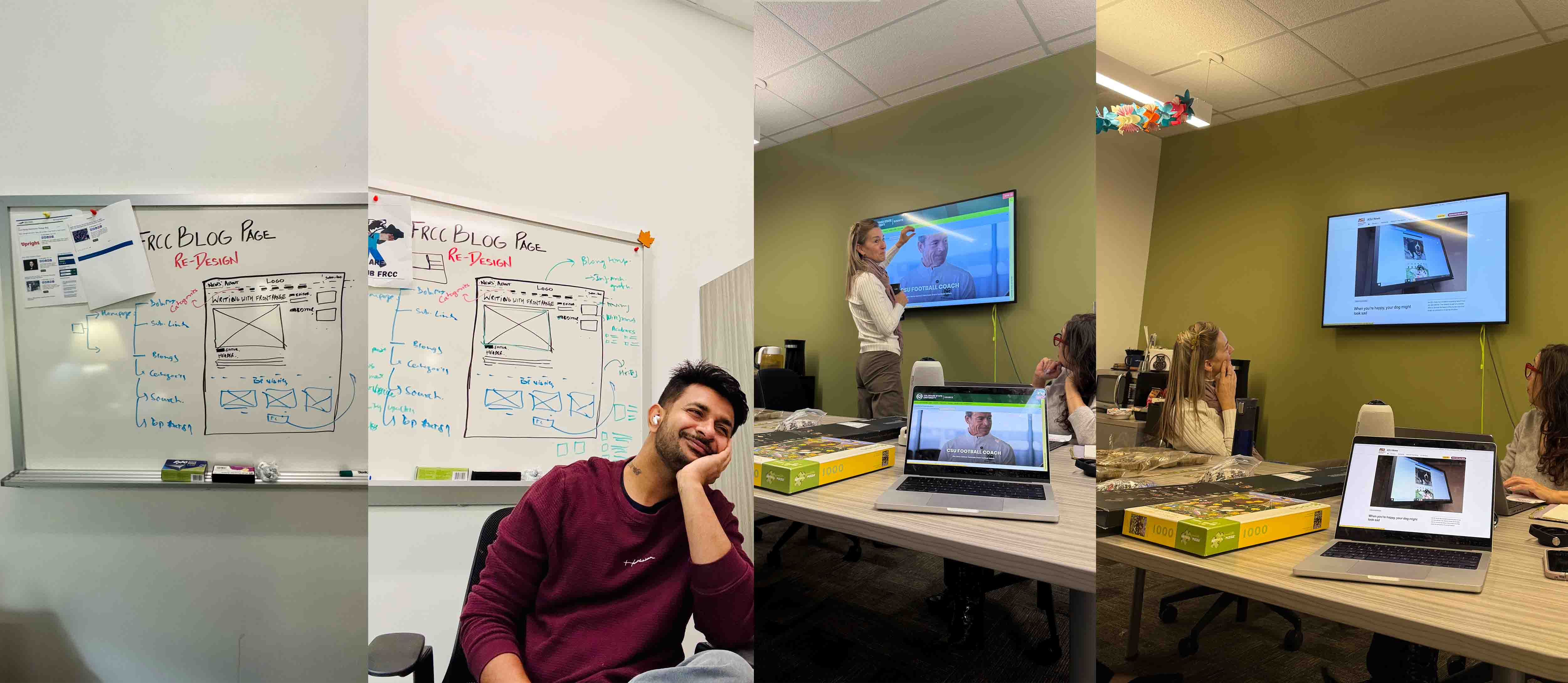
Team discussion
User research results & insights
Across groups, common themes emerged: users valued structured navigation over an endless feed, needed clearer visual hierarchy, and expected the news experience to reflect FRCC's brand and strategic intent.
The platform limited users to a single unfiltered feed with no functional information architecture, inconsistent templates, weak metadata, and low-visibility CTAs.
98% of traffic came from new readers, with sessions averaging 1.36 minutes and mostly single-page.
Each persona failed differently: prospective students could not explore related programs, current students found the layout text-heavy, contributors saw their work buried, and leaders lacked insight into downstream actions.
Every group valued structured navigation, clearer hierarchy, and a news experience aligned with FRCC's brand and strategic intent.
Stakeholders consistently favored designs that surfaced more stories at once and reduced hidden interactions: the persistent category bar and the grid-first card layout with multiple CTA points per scroll.
54% task success, roughly 40% navigation comprehension, and 22% filtering success on the existing platform.
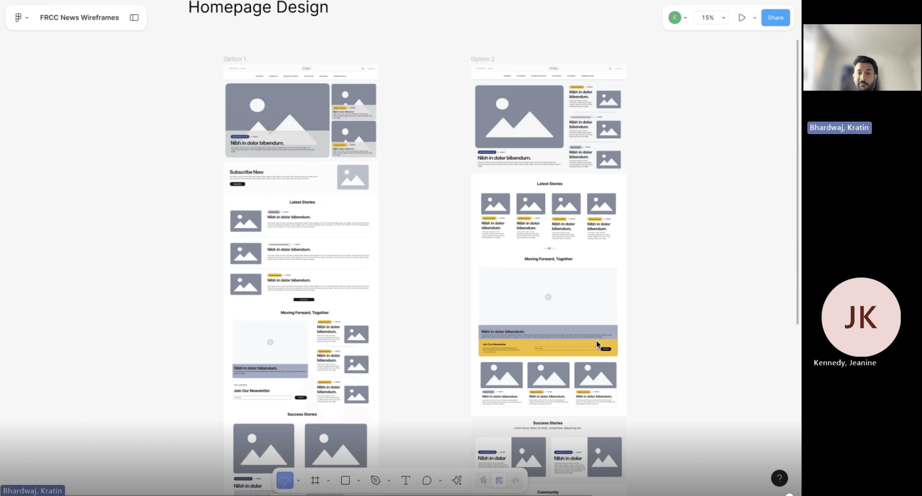
Validating early directions through A/B testing
One story. Two paths.
The previous structure was a single undifferentiated menu over an unsorted feed. The redesign introduced two layers: eight topical sections for browsing and five strategic pillar tags that cut across them. Every story lives once and surfaces through both, and each path resolves to the same article detail.
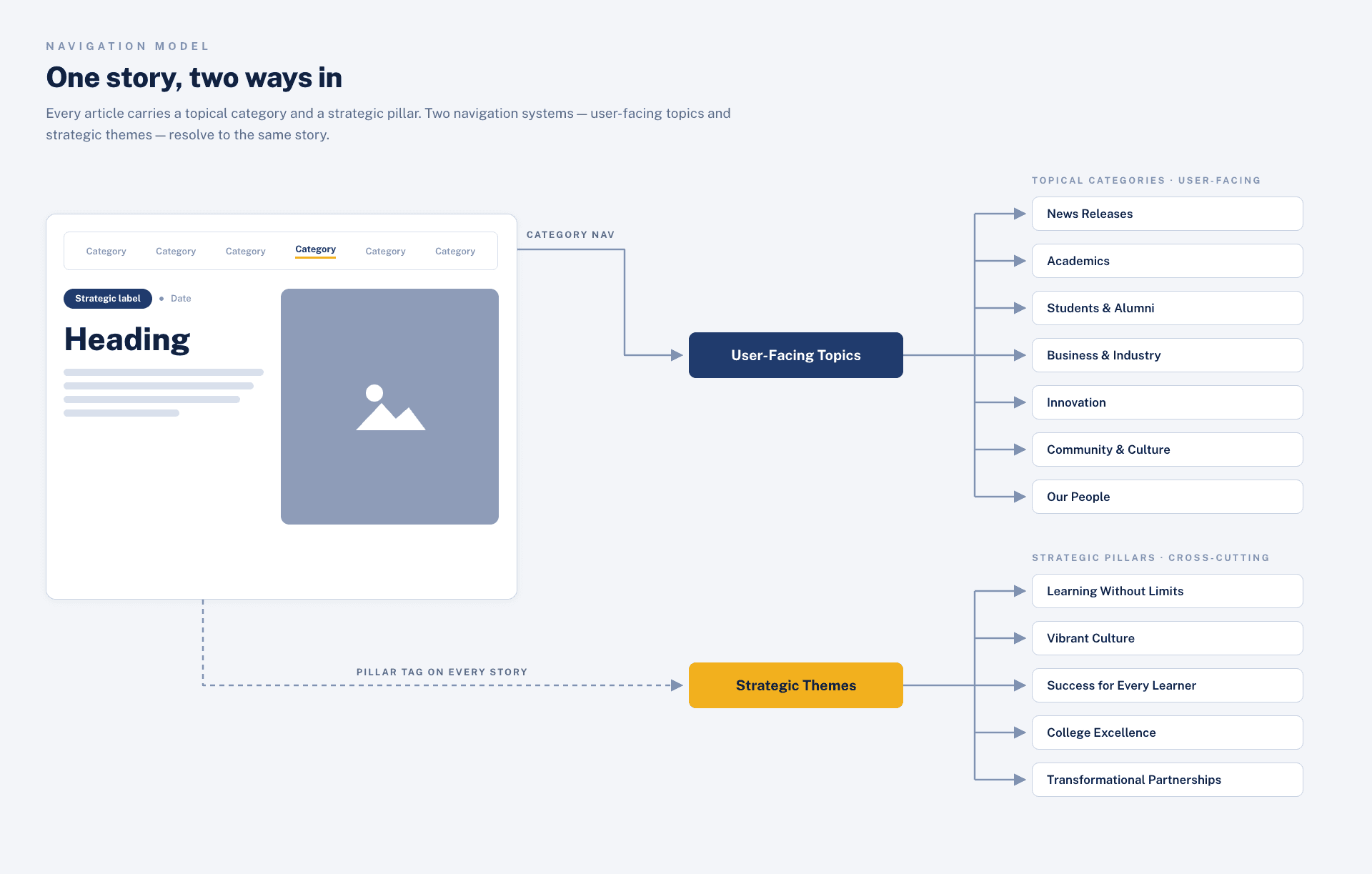
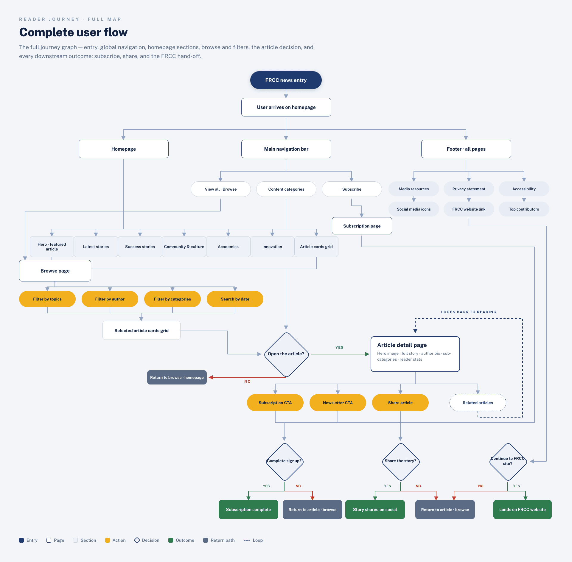
Dual navigation framework: topical categories and strategic themes

Dual navigation framework: topical categories and strategic themes
A system the brand can scale on.
I conducted a full visual audit of the existing blog to understand how colors, typography, components, and layouts were being used, and where inconsistencies were creating friction. I then created a refreshed FRCC News design system grounded in the college's brand.
Accessible pairings across every surface.
Acumin Pro Condensed for all headings and UI text.
Primary, secondary, and inline actions.
Supporting 1, 2, and 4 column layouts.
Highlighted sections, media blocks, and newsletter banners.
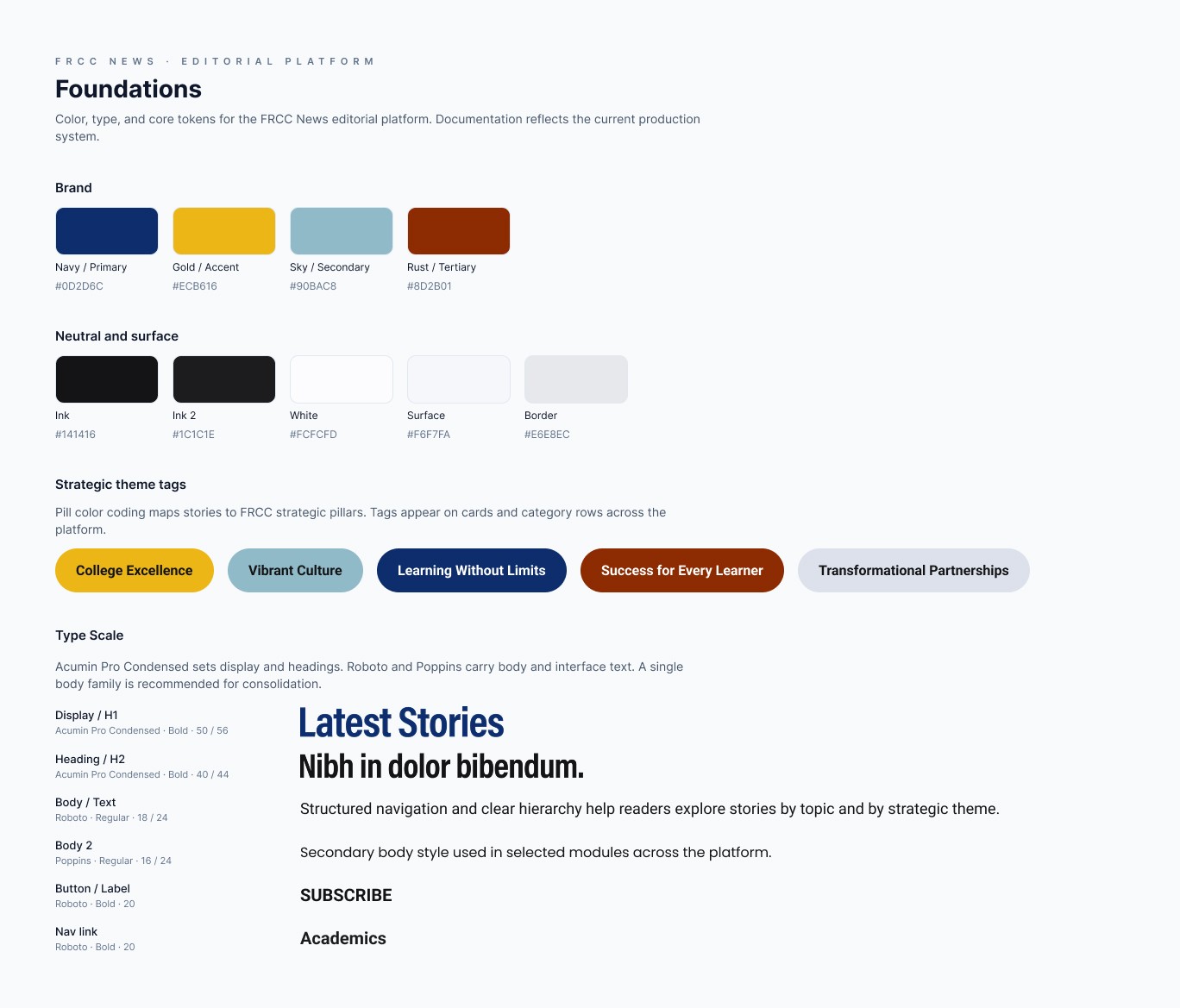
Design system
At the UI level, I introduced a modular card system used across all listing pages. Each card displays the article image, headline, metadata, and an excerpt. Accessibility was built in from the start: all colors meet WCAG AA contrast standards, all images should include alt text, focus states are clearly visible, and every template is fully responsive.
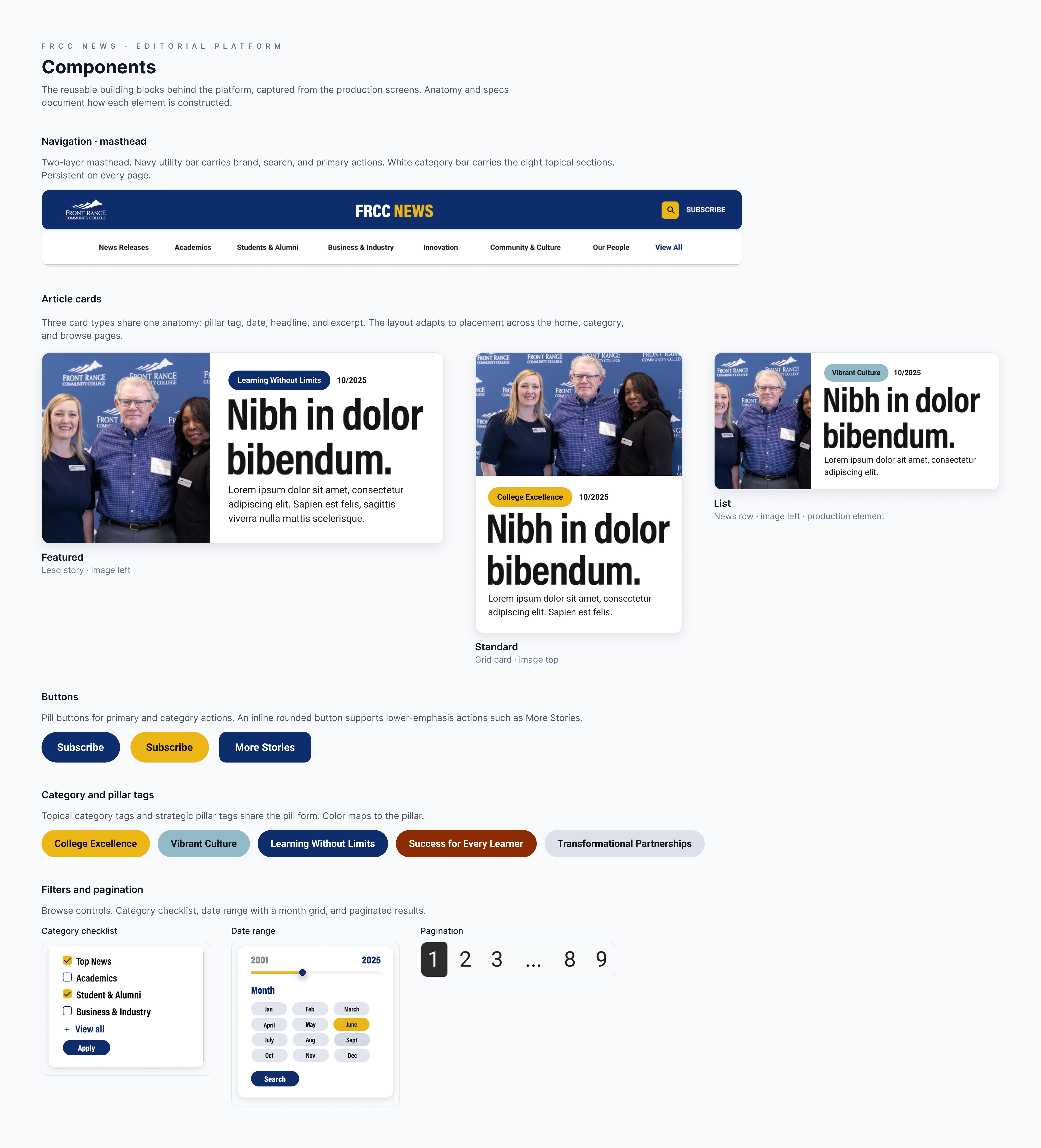
Bringing the new FRCC News experience to life.
The top navigation includes the main content areas and remains consistent across all pages. Each major section has its own category landing page, along with direct access to the main FRCC website, a dedicated Browse page, a Top Contributors page, a prominent site-wide search bar, and a Subscribe Now button placed in the header. A second Join our FRCC News newsletter CTA at the bottom of listing pages creates strong entry and exit points for subscription, and the Browse page consolidates every article with robust filters for categories, tags, contributors, and date.
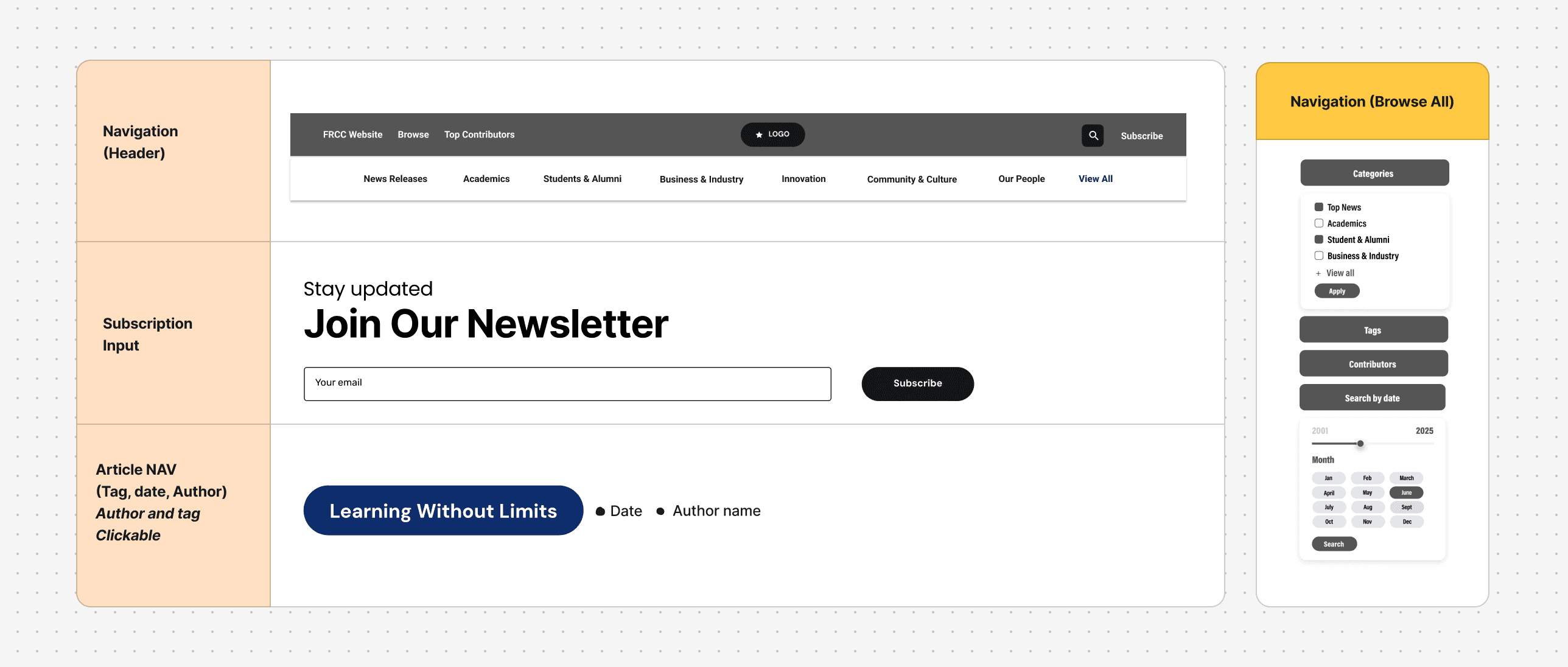
Foundational UX structure: navigation, filters and page frameworks
The layout emphasizes clarity and exploration: a persistent top navigation anchored by user-facing categories, a flexible grid that adapts from featured hero stories to standard cards, clear metadata patterns that help users orient quickly, a redesigned article template with improved typography and strong CTAs, and related stories and share actions placed where engagement is most natural.
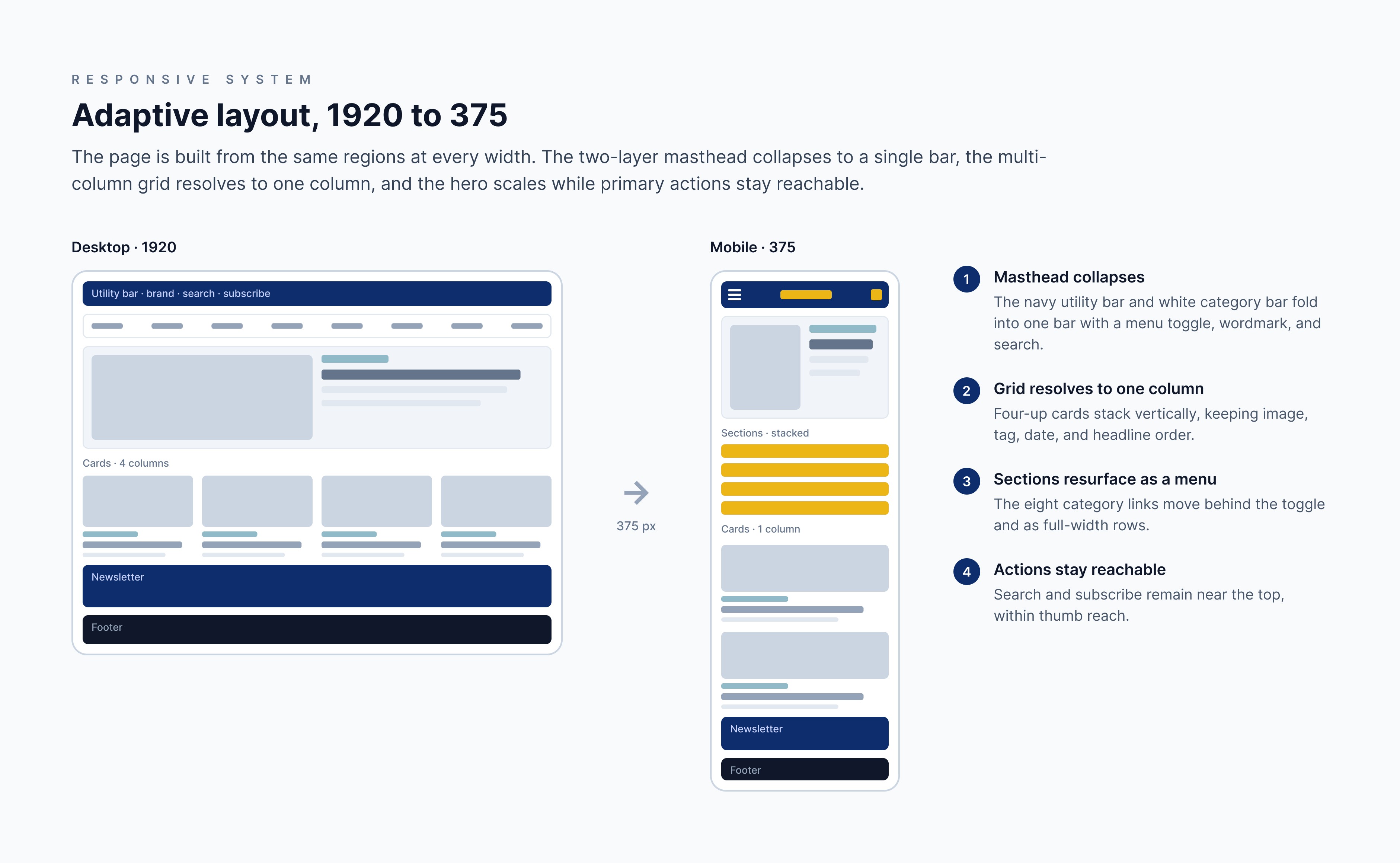
The mobile design prioritizes speed, readability, and thumb-friendly interaction: a simplified mobile nav with clear category access, scannable card layouts that maintain hierarchy at small sizes, improved article readability, sticky share and subscribe actions placed where mobile users naturally pause, and tap-friendly filter and tag interactions on browse pages.
Explore the final designs directly in Figma
Validated before a line of code.
Before finalizing the redesign, I ran moderated usability sessions and click-through testing on the high-fidelity prototype. The goal was to validate core UX decisions, navigation, hierarchy, discoverability, and comprehension, before engineering investment.
92% of users correctly understood each top-level category, versus roughly 40% previously. Users clearly distinguished Categories from Tags.
86% successfully refined results using filters, up from 22%. Users preferred tag-based exploration over month archives.
7 of 8 participants scrolled deeper than in the old layout. Full-width reading and improved typography increased perceived trust and professionalism.
No participants mistook the mid-article CTA as the end of the page, and 5 of 8 said they would likely subscribe from that location.
All participants said author bios improved credibility. Several naturally clicked the author name after reading stories they liked.
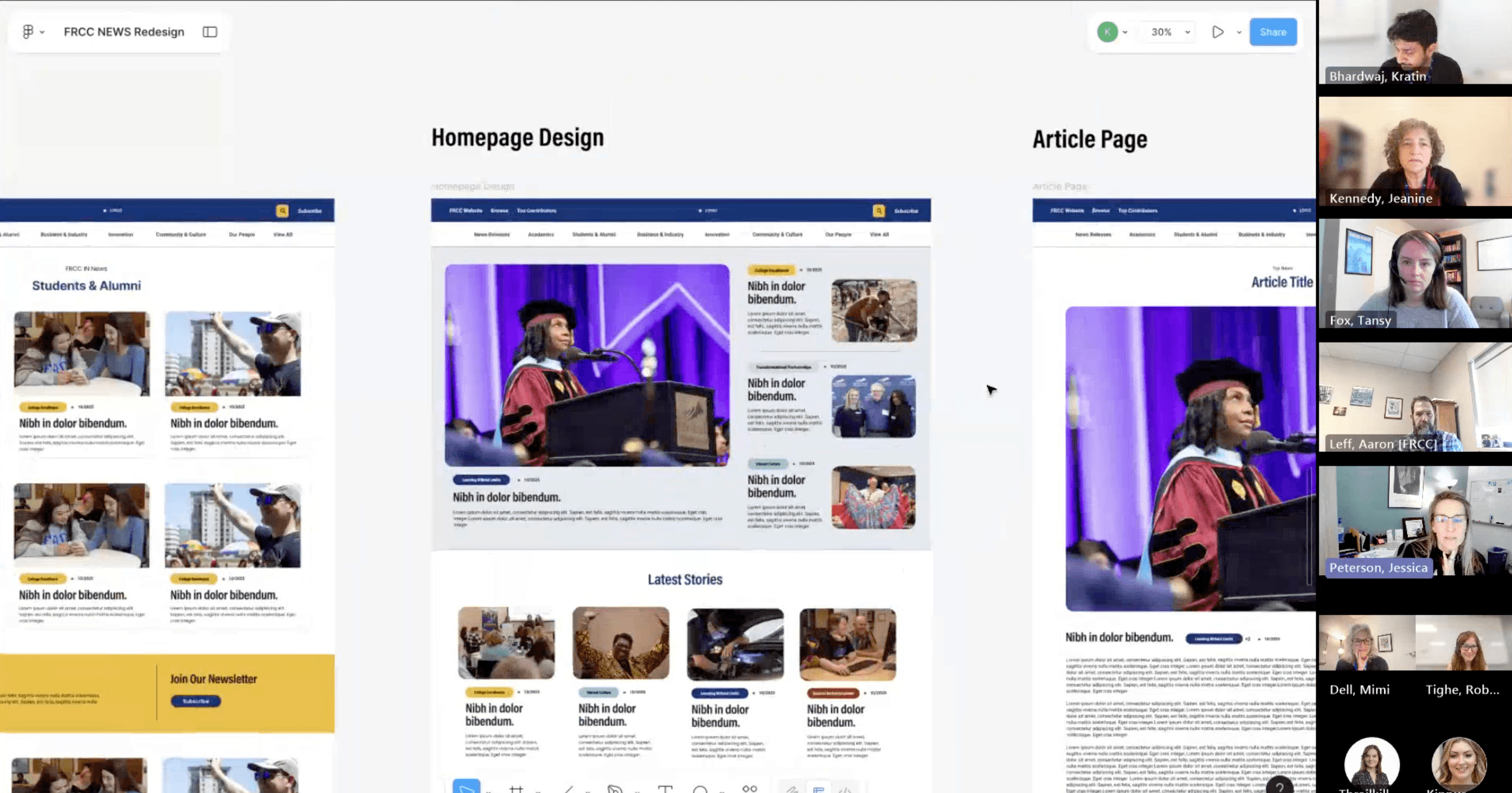
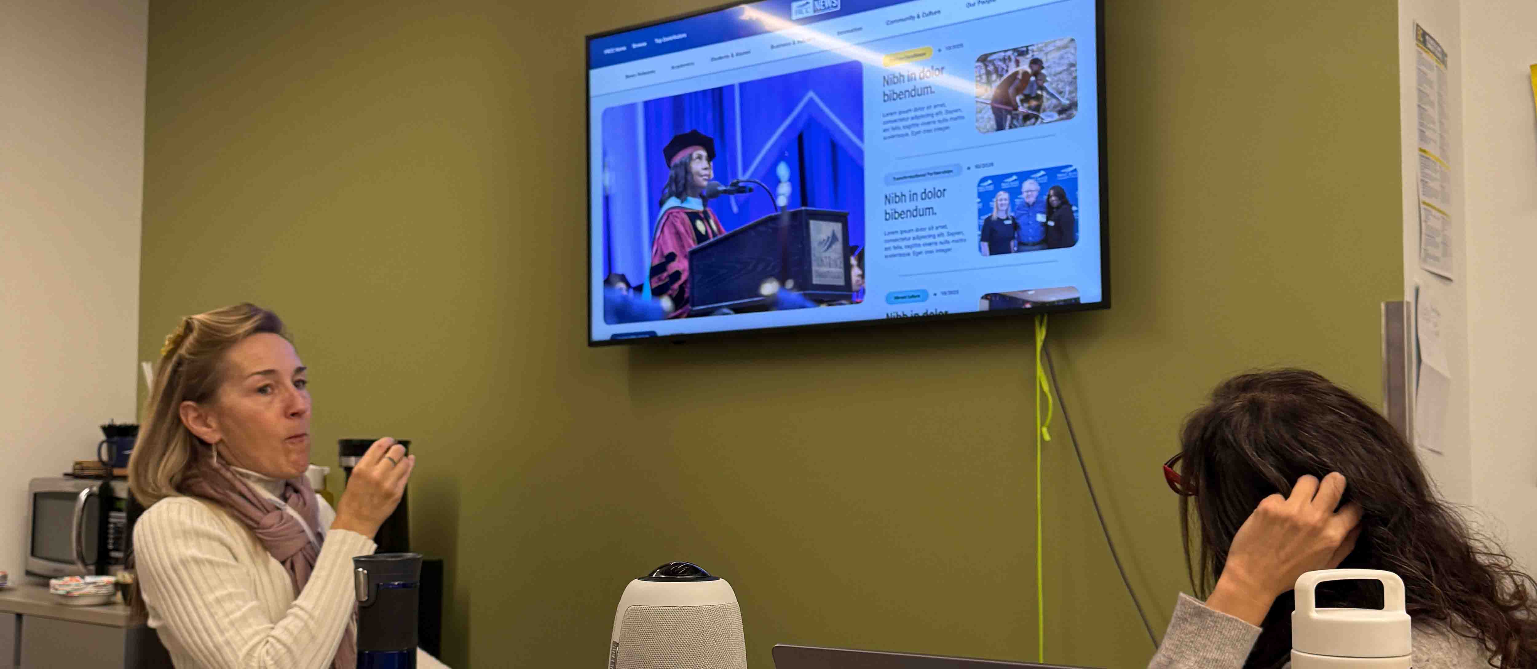
Final design discussion
Testing confirmed that the new IA was clear, intuitive, and aligned with how users think, that the dual-navigation model served both audience needs and FRCC's strategic themes, and that the design system reduced cognitive load and created visual consistency. The flow naturally supported all key business outcomes: discover content, stay longer, subscribe.
What readers and stakeholders said.
“As someone who publishes content here, I love how my articles look now. The visual treatment really makes them shine.”
“This redesign significantly strengthened our digital brand presence. We've seen measurable improvements in engagement.”
“The new blog is so much easier to navigate on my phone. I actually check it daily now!”
Takeaways
Architecture was the product: the stories were never the problem; the structure hiding them was. Fixing the IA moved every metric at once.
Strategy is negotiated, not imposed: dual navigation gave leadership strategic plan visibility without breaking reader mental models, and the data made that case for me.
The grid won on evidence, not taste: A/B testing settled the layout debate with more stories per scroll and more CTA points, not opinions.
Systems outlast screens: tokenized components, accessible pairings, and responsive templates mean the platform grows without redesign.
Thoughtful constraint breeds innovation: the most impactful improvements came not from adding complexity, but from ruthlessly simplifying the experience around core user needs.