ANJ · The NEXT WAVE Experience
ANJ Website Revamp: The NEXT WAVE Experience
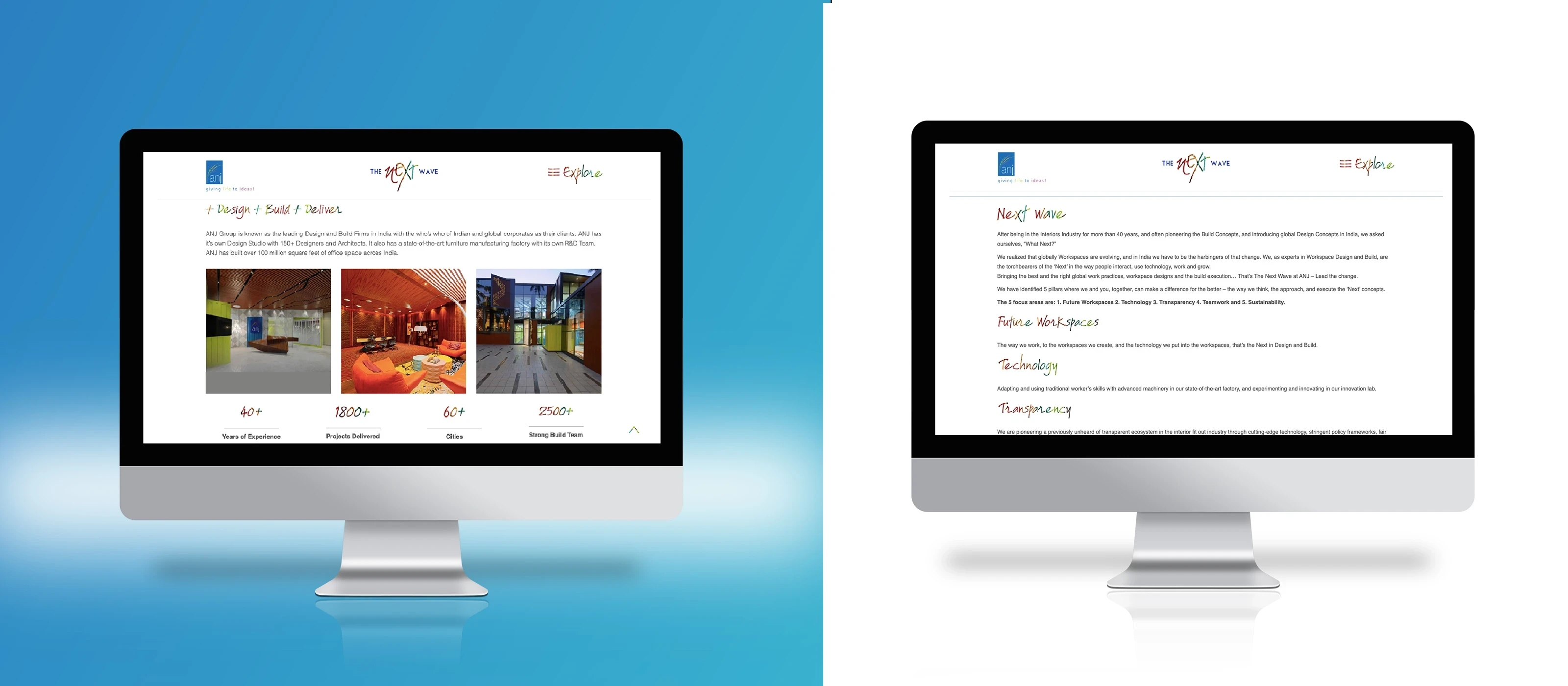
Redefining the digital legacy of an industry giant. For over 40 years, ANJ has defined physical workspaces in India. However, their digital presence remained stuck in the past. As the Lead UX Designer, I steered the end-to-end redesign of their platform to align with their new NEXT WAVE brand identity.
The result was a responsive, accessible, and data-driven experience that did not just look modern: it delivered a 40% increase in user engagement and solidified their position as a tech-forward leader.
40%
increase in click-throughs via interactive elements
55%
boost in engagement from intuitive IA
AA
fully WCAG 2.1 AA compliant
100%
responsive across all devices
ANJ · NEXT WAVEInnovation · Technology · Sustainability
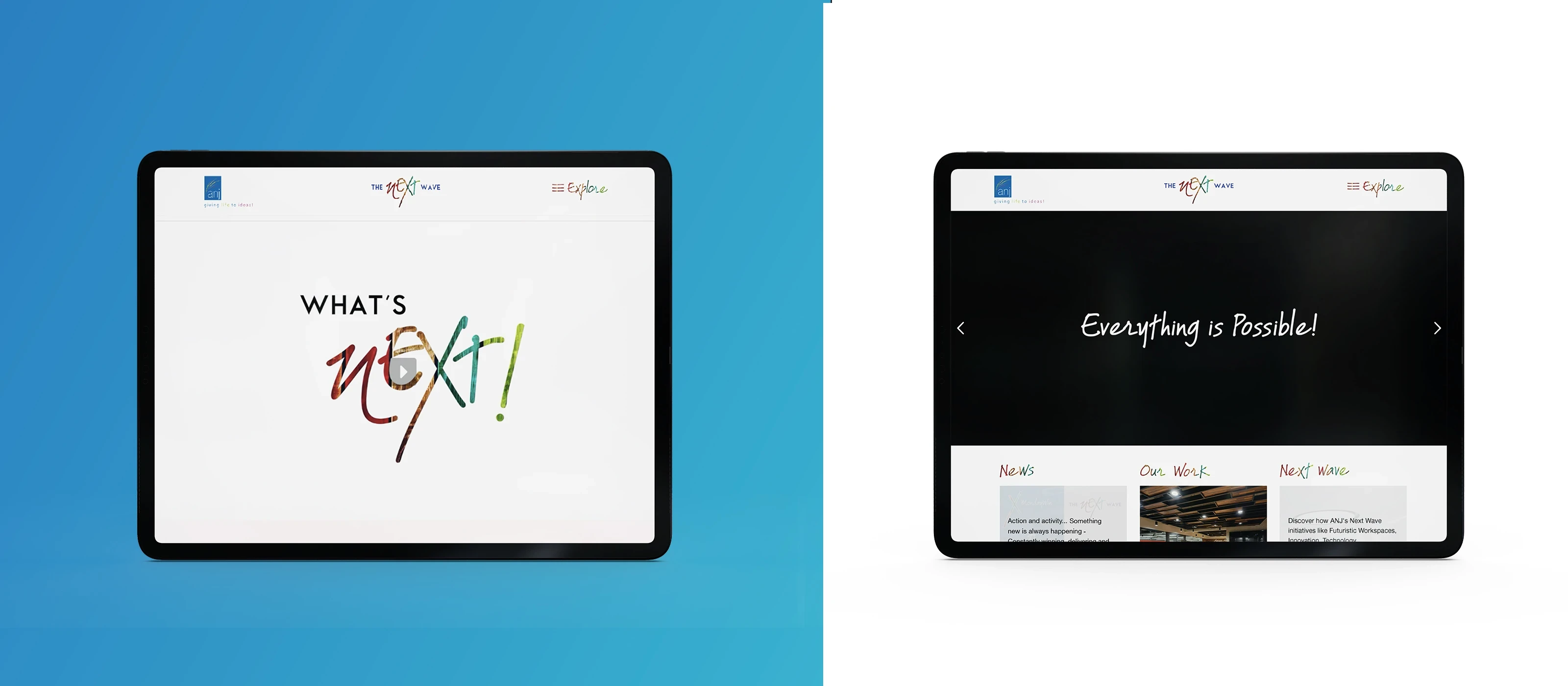
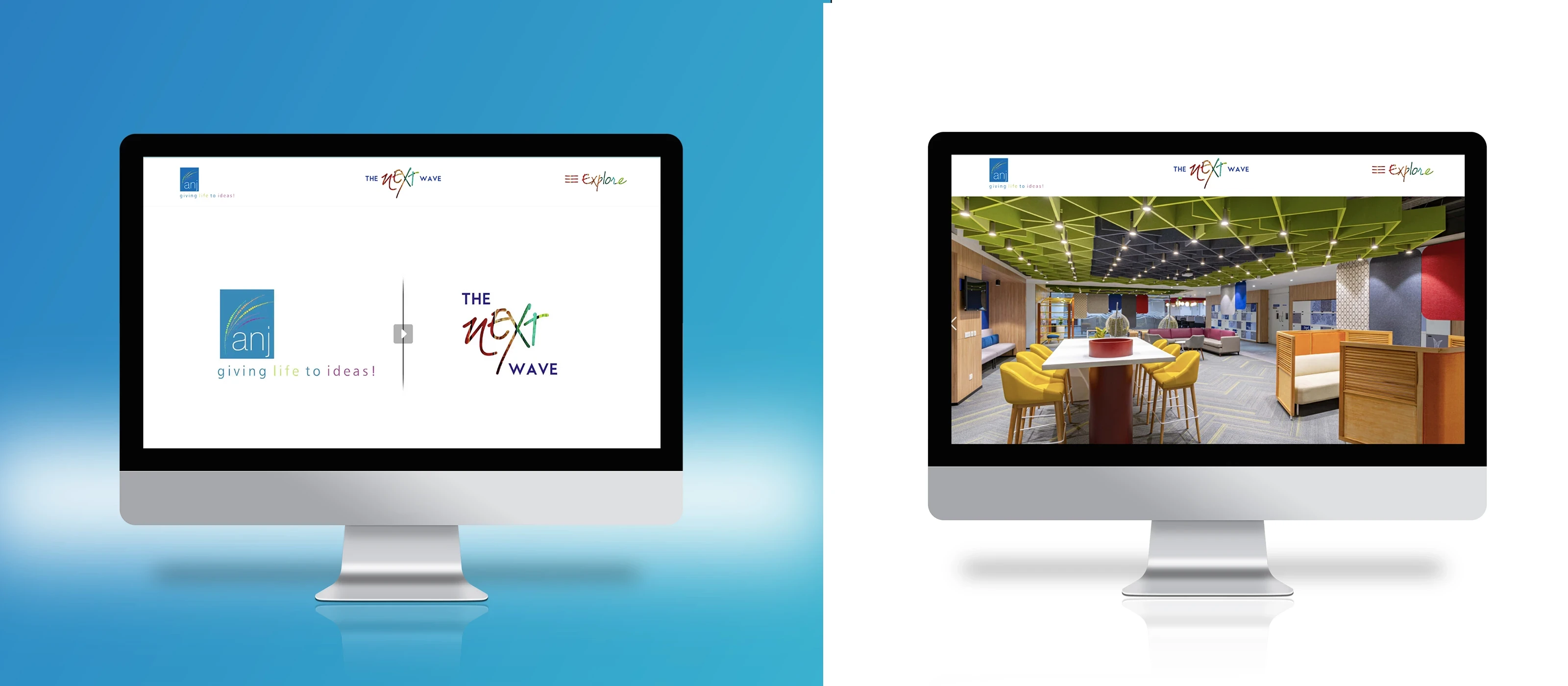
A 40-year legacy, redesigned to feel like the future.
1
Discovery and validation
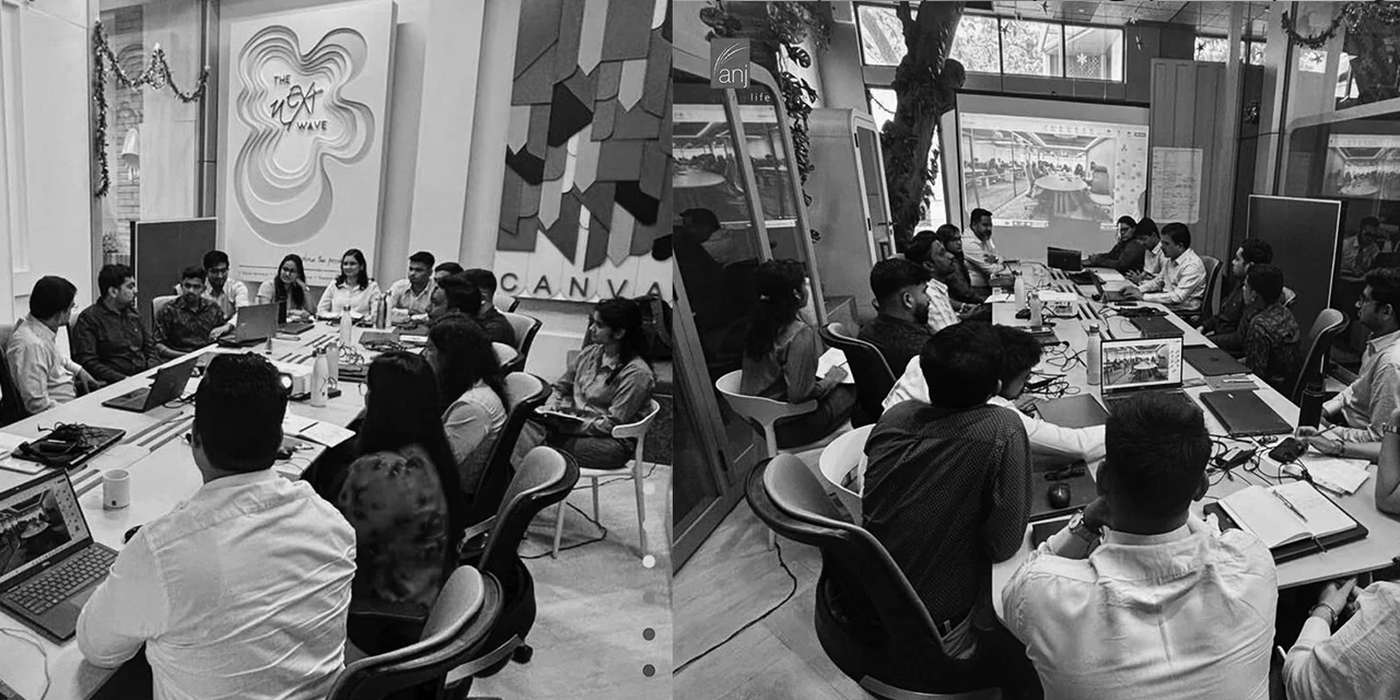
Surveys with employees, clients, and stakeholders, plus concept validation sessions.
2
Sizing and prioritization
Critical pain points identified, resources allocated to high-impact areas.
3
Iterative design
Wireframe and prototype cycles, validated through usability testing.
4
Measured impact
Engagement, accessibility, navigation, and mobile tracked against the baseline.
01 · The Problem Context
A new identity the old site contradicted.
ANJ, a 40-year veteran in the Design and Build industry, was launching its new brand identity: NEXT WAVE. However, their existing digital presence contradicted this new vision of innovation.
01Fragmented Identity. The site failed to communicate the modern, forward-thinking ethos of the NEXT WAVE concept.
02Accessibility Barriers. Non-responsive layouts alienated mobile users, and the site lacked basic accessibility compliance.
03High Cognitive Load. Poor navigation and cluttered layouts frustrated users, leading to weak engagement and task failure.
02 · Strategic Objectives
Not a refresh. A total experience overhaul.
The goal was not just a visual refresh, but a total experience overhaul to position ANJ as an industry leader.
01Brand Integration. Seamlessly weave the NEXT WAVE philosophy (Innovation, Technology, Sustainability) into the UI.
02Optimize Usability. Streamline Information Architecture (IA) to reduce friction.
03Ensure Inclusivity. Achieve WCAG 2.1 AA compliance and full device responsiveness.
03 · The Process
Data-backed, not just aesthetic.
We adopted a phased, user-centric approach to ensure design decisions were data-backed rather than just aesthetic.
Phase 1: Discovery and Validation
Conducted surveys with employees, clients, and stakeholders to map expectations. Assessed the viability of the NEXT WAVE concept through concept validation sessions.
Phase 2: Sizing and Prioritization
Identified critical pain points (navigation, mobile responsiveness) and allocated resources to high-impact areas.
Phase 3: Iterative Design
Executed wireframing and prototyping cycles, validating decisions through usability testing before moving to high-fidelity.
04 · The Solution
A framework that lets the brand breathe.
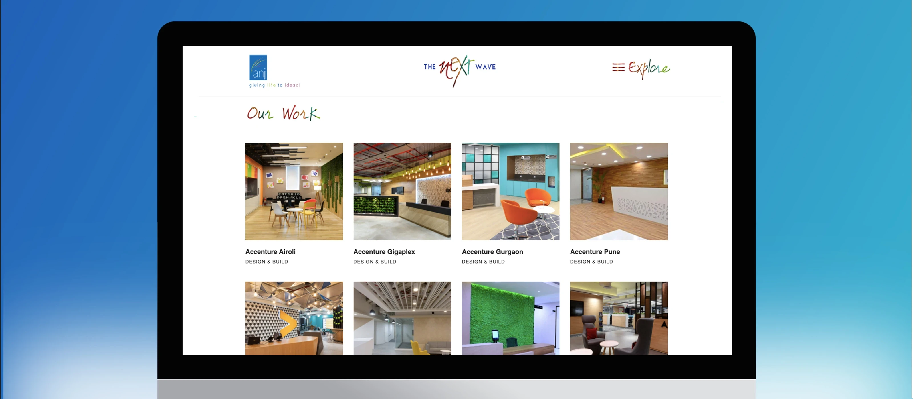
The new design utilized a minimalist, technology-focused framework that let the content, and the brand, breathe. Core experience upgrades:
01Responsive Framework. Built a fully fluid layout optimized for desktop, tablet, and mobile, capturing the previously lost mobile audience.
02Accessibility First. Implemented adjustable text sizes, keyboard navigation, and high-contrast modes to meet WCAG 2.1 AA standards.
03Micro-Interactions. Added dynamic hover effects and transitions to guide users and make the interface feel alive.
05 · The Impact
Every baseline, moved.
40%
Engagement
From low interaction to a 40% increase in click-throughs via interactive elements.
80%
Accessibility
From non-compliant to an 80% enhancement, fully WCAG 2.1 AA compliant.
55%
Navigation
From weak and unclear to a 55% boost in engagement due to intuitive IA.
100%
Mobile Experience
From non-optimized to 100% responsive across all devices.
Brand
Brand Perception
From outdated to strong leadership positioning as an innovator.
06 · Reflection
What this project sharpened.
01Balancing Act. Learned to balance aggressive brand expression (NEXT WAVE) with fundamental usability principles.
02Technical Proficiency. Deepened expertise in responsive grid systems and accessibility standards (WCAG).
03Research-Led Design. Validated that investing time in early user surveys and prioritization matrices significantly reduces friction during the design phase.
Investing time in early user surveys and prioritization matrices significantly reduces friction during the design phase.