Visual Storytelling
Six visual explorations across editorial layout, interaction concepts, and campaign design, spanning still imagery, live interactive prototypes, and motion.
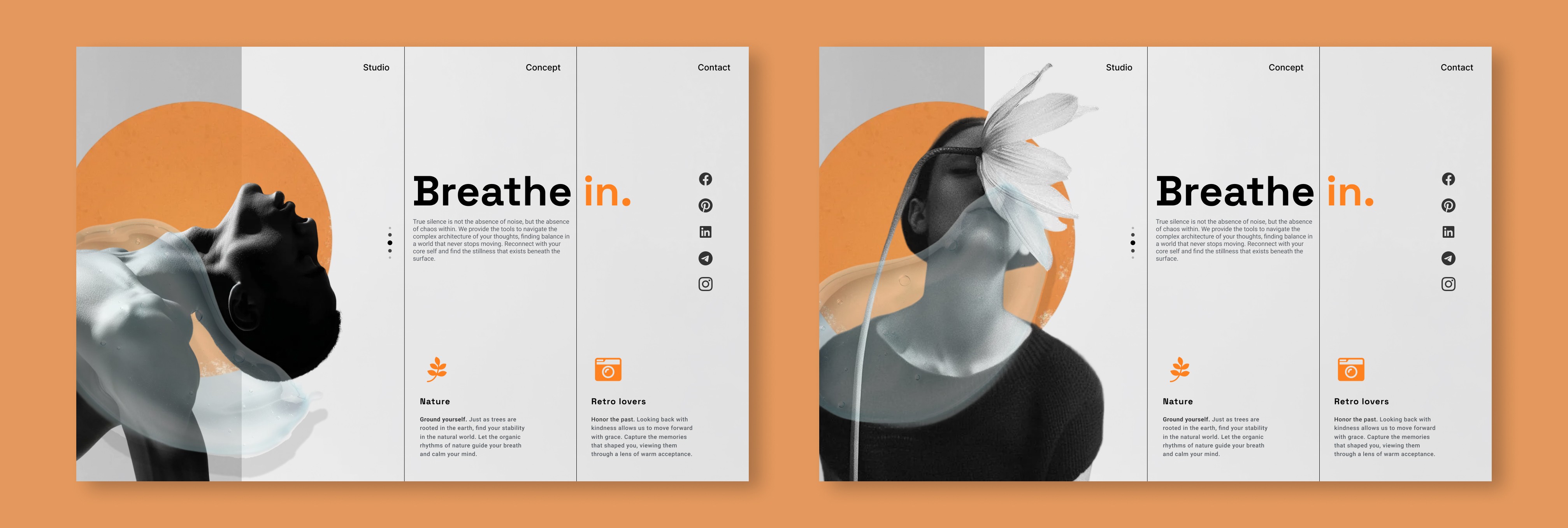
Digital Sanctuary: Visualizing the Pause
In an era of infinite scroll and cognitive overload, digital interfaces rarely offer a moment of stillness. This visual exploration challenges the frantic pace of modern web experiences by prioritizing negative space and organic textures.
The goal was to translate the physiological act of taking a breath into a UI layout, using structured grids to create stability, while fluid imagery introduces a sense of release. It serves as a reminder that visual storytelling can be a functional tool for emotional regulation.
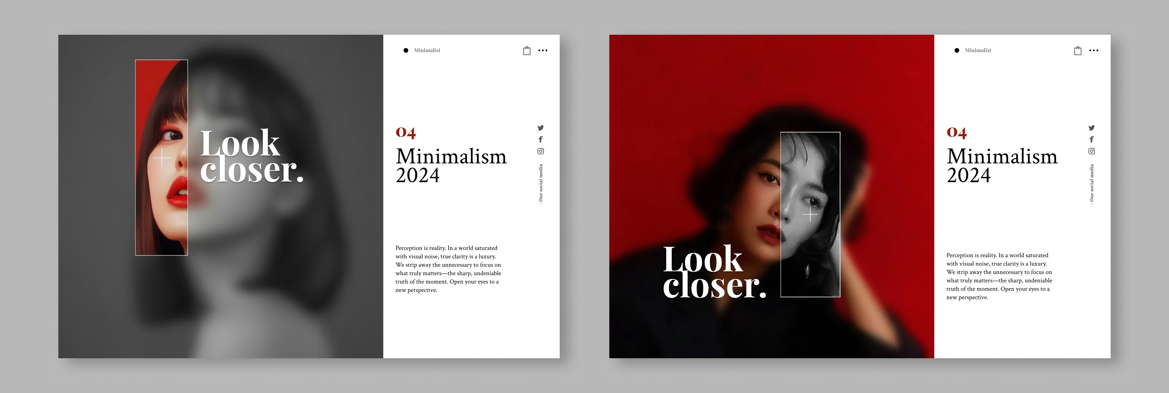
Selective Attention and Visual Noise
A visual experiment aimed at bridging the gap between high-fashion print magazines and interactive web experiences.
The challenge was to maintain a strict Swiss-style typographic grid while introducing disruptive elements, like the sharp rectangular mask in the Minimalism piece or the organic liquid overlay in the Breathe piece. This project demonstrates how rigid grid systems can coexist with fluid, artistic expression to create memorable digital brand experiences.
Digital Utility: The Interactive Light Switch
Standard e-commerce experiences are static, but lighting is dynamic. I wanted to bridge the gap between browsing a catalog and physically interacting with the product.
By repurposing the standard Dark Mode toggle into a literal light switch, users can instantly visualize how these sculptural pieces transform a room. It turns a passive scrolling experience into an active product simulation, allowing the user to control the ambience of the digital shop floor just as they would their own home.
The Anatomy of a Choice
A surreal triptych exploring the abstract phases of decision-making: contemplation, confusion, and the final act of choosing.

The Zest Campaign: Redefining Seniority
A conceptual merchandise line designed to challenge ageist stereotypes in visual culture. Traditional marketing for the 65+ demographic is often clinical or passive.
This project proposes an alternative identity: one defined by vitality, rebellion, and play. By placing hyper-active imagery, skating, dancing, and laughing, on everyday utility items like tote bags, the design turns a functional object into a walking manifesto for growing bold, not old.

The Warm Welcome: Affective Onboarding
Onboarding screens are often cold and functional. This concept explores Affective Design: using a recognizable, comforting character to reduce user anxiety during a sign-up flow.
By animating the wave gesture, the interface acknowledges the user's arrival with a human-like social cue. It transforms a static Welcome page into a moment of connection, setting a friendly tone for the rest of the application experience.
