

Redesigning FRCC’s News Platform
This redesign elevated FRCC’s News platform into a modern, high-performing editorial system serving 44,700 annual visitors. As the institution’s primary storytelling and brand-building channel, the platform now supports clearer content discovery, intuitive navigation, and a scalable information architecture that drives high-value actions such as program exploration, article sharing, and newsletter subscriptions.
The redesign strengthened FRCC’s digital presence across its multi-campus network, transforming the News site from a static archive into a strategic content engine that supports recruitment, recognition, and long-term audience engagement.
Timeline
June '25 - Dec'25
Role
Product Designer
Led end-to-end product strategy, UX research, visual design, prototyping, testing, and developer handoff.
The Challenge
The FRCC blog lacked a functional information architecture and coherent UI structure, limiting users to a single unfiltered feed with no clear paths to explore deeper or program-specific content. Inconsistent templates, weak metadata, and low-visibility CTAs reduced discoverability and conversion, while outdated visuals diluted brand trust.
These issues resulted in broken user flows—minimal exploration, negligible subscriptions, and stagnant engagement metrics—showing the platform could not support a structured, editorial-quality experience aligned with current UX and accessibility standards.
Our high-level goals were to:
1. Build a clear information architecture with intuitive browsing paths.
2. Rethink the UI and introduce a cohesive, brand-aligned editorial look.
3. Standardize article templates with stronger hierarchy, metadata, and prominent CTAs.
4. Increase engagement by enabling deeper exploration and improving key user flows.
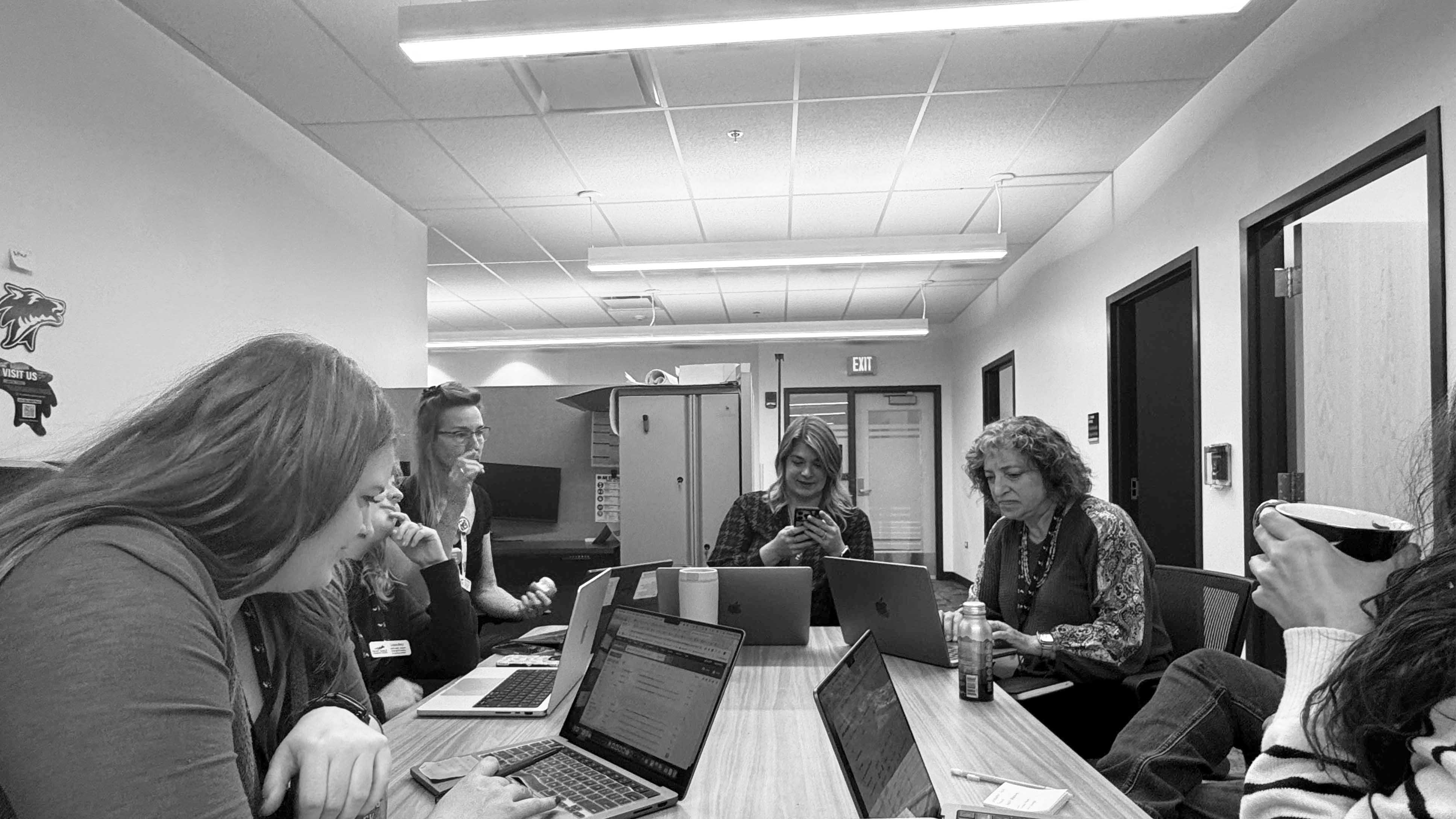
Generative Research
To ground the redesign in real user and institutional needs, I conducted stakeholder interviews and user research before moving into design. Conversations with the project sponsor, marketing leadership, and the EVP of Communications clarified strategic priorities: connect every story to FRCC’s strategic plan, increase content relevance across audiences, and grow an underutilized subscriber base.
I supplemented these insights with user interviews across four primary audience groups and translated them into actionable personas:
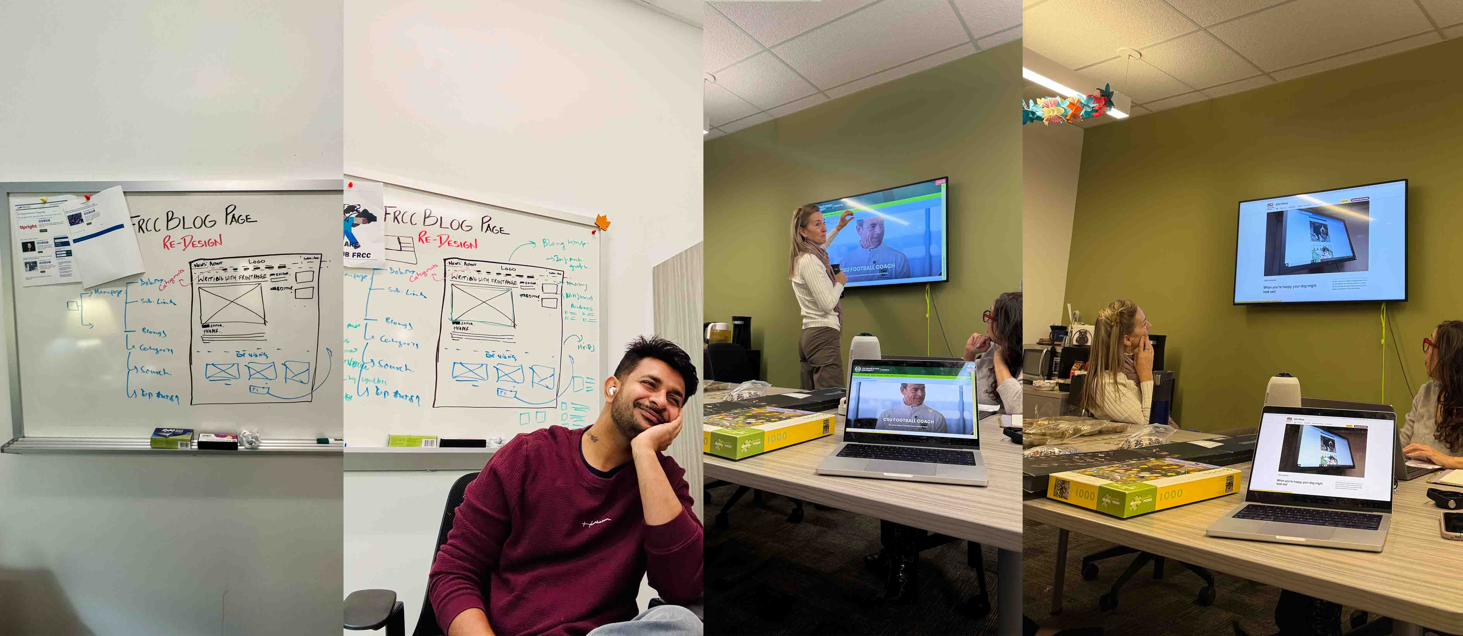
Early Design Work
I created current and proposed user flow diagrams. The “current blog flow” had almost no branching: users landed on a homepage post and could click “Read More,” then hit a dead-end. The “redesigned flow” introduced category pages, tag filters, search, and clear back paths to related content.
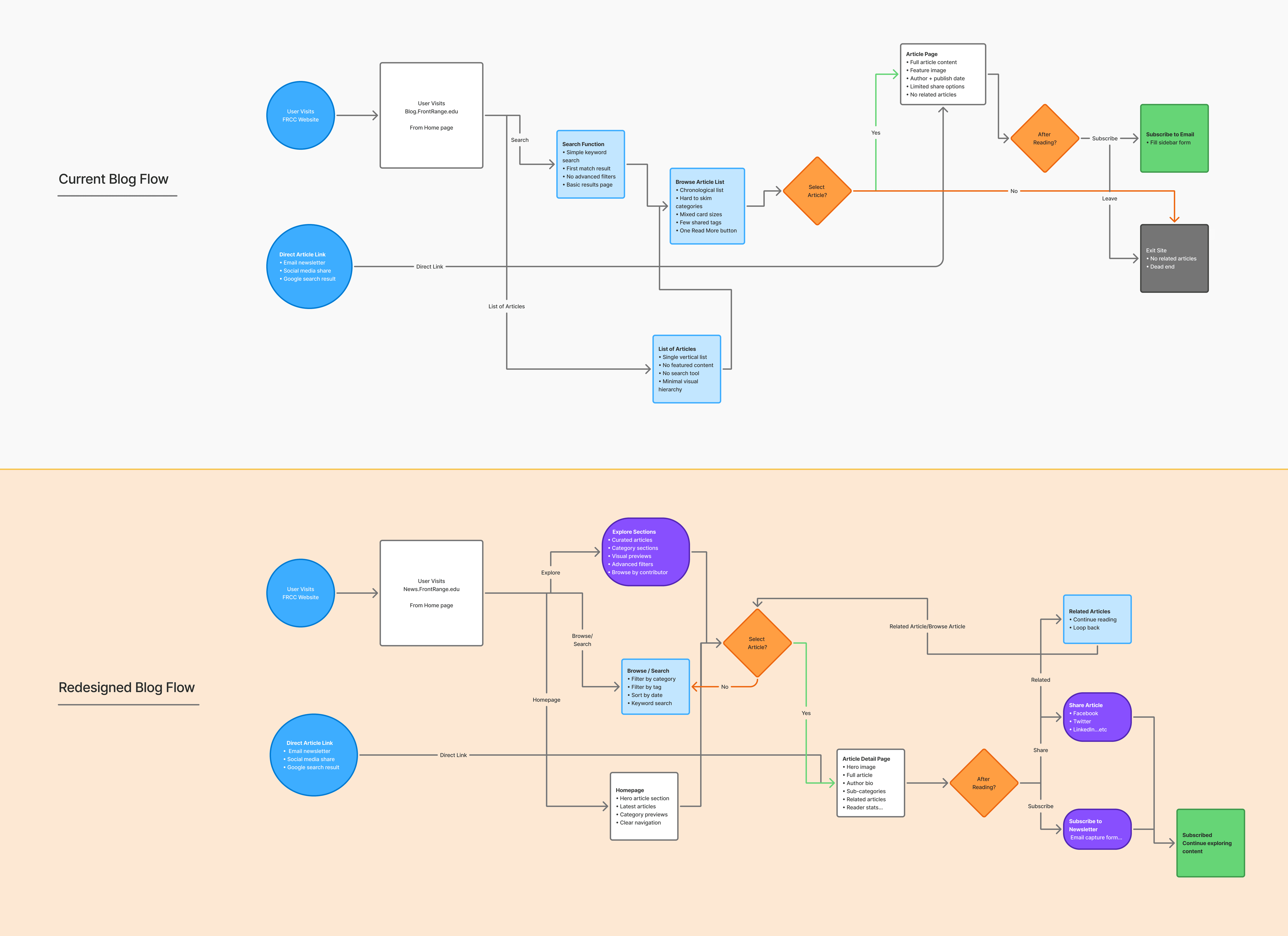
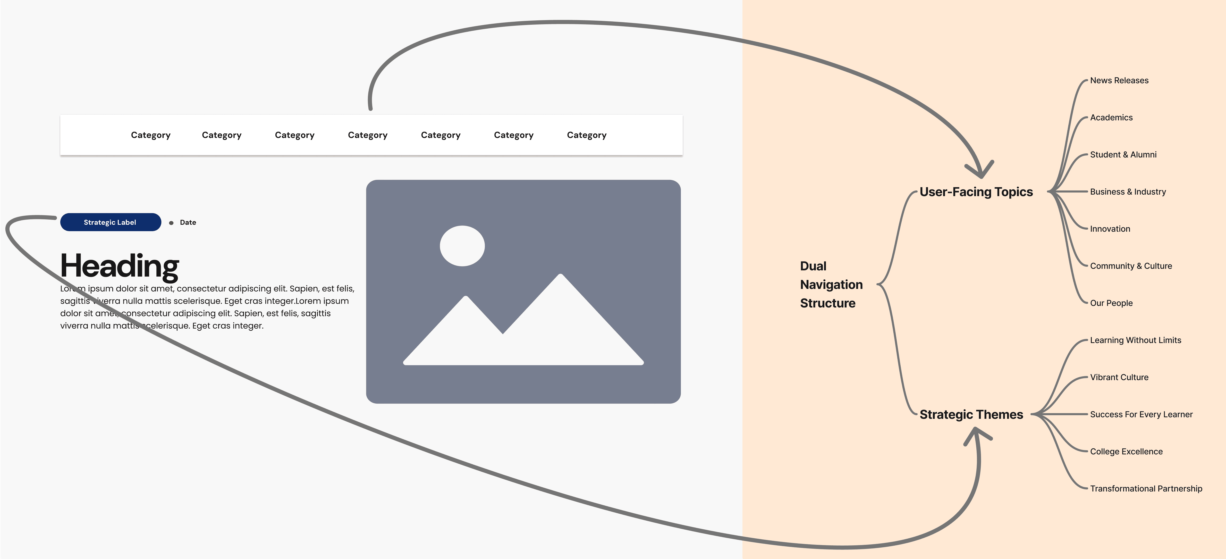
With insights in hand, I sketched an updated information architecture and user flows. The new IA (see diagram below) was organized around two axes: user-facing topics and strategic themes.
I defined a top navigation with FRCC-relevant sections – Top News, Academics, Student & Alumni, Community, Innovation, College Success – based on stakeholder input and content audit. In parallel, I mapped out “strategic labels” (e.g. Learning Without Limits, Vibrant Culture, College Excellence) to tag posts with FRCC’s institutional priorities. This dual structure allowed readers to find content by either audience interest or by the College’s strategic pillars.
Narrowing the Scope
Next, I worked with the steering committee to prioritize features. We had to balance the College’s strategic goals against development constraints. A key tradeoff was feature complexity vs. timeline: stakeholders wanted robust category/tag systems and accessibility compliance, but we agreed to focus first on the elements that would have the greatest impact (core navigation, essential CTAs, and content templates), while deferring more advanced search or personalization to later phases.
As part of this process, I ran a series of A/B design tests to validate early assumptions before committing to a direction. These tests focused on header structure, feed layout, and the density of visible content.
For example, we compared a hover-based header (Variant A) against a persistent category bar (Variant B), and a list-first article feed against a grid-first layout. Stakeholders consistently favored designs that surfaced more stories at once and reduced hidden interactions, so we treated the results of these comparisons as inputs for final prioritization.
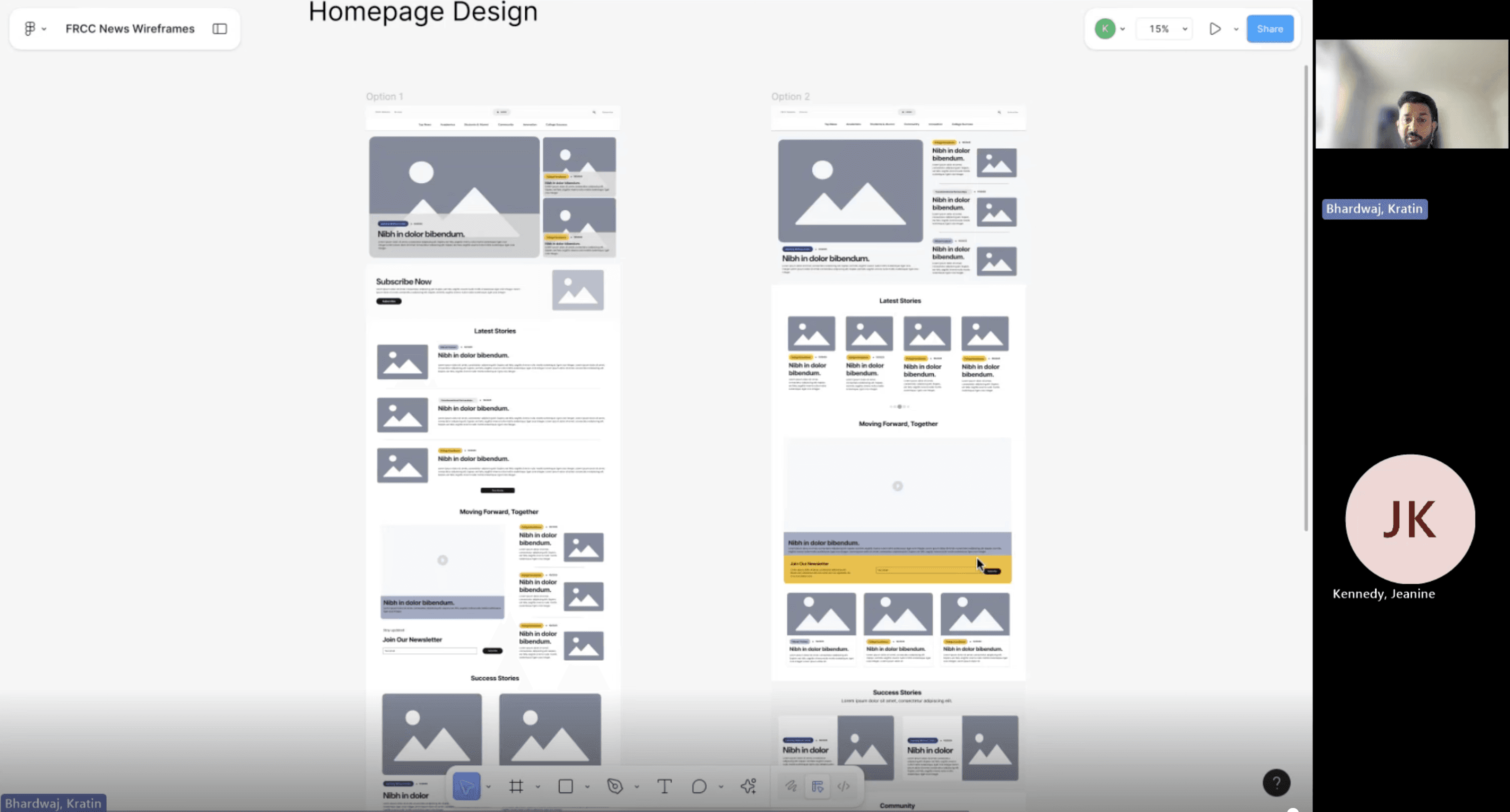
Validating Early Directions: Scope Refinement Through A/B Testing
We also debated the layout approach. Our internal design exploration included two header options (hover-revealed cards vs. split featured content) and two feed options (list-first vs. grid-first). The A/B tests showed a clear preference for the grid-based card system, which provided high visibility of content despite the slightly reduced focus on any single story. The grid maximized discoverability with more stories visible per scroll and allowed us to surface multiple CTA points (e.g., subscribe banners) across the interface.
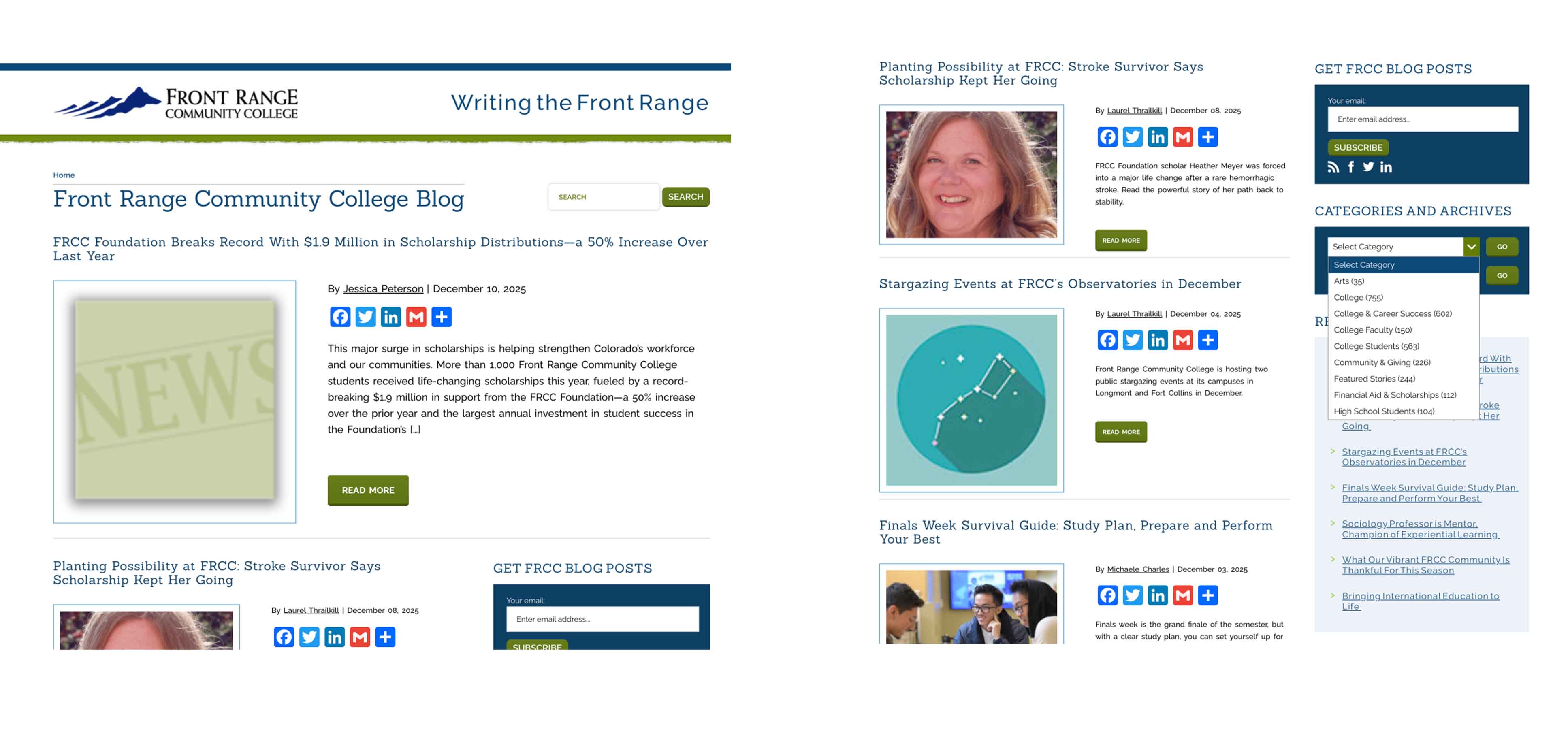
Building a Foundation
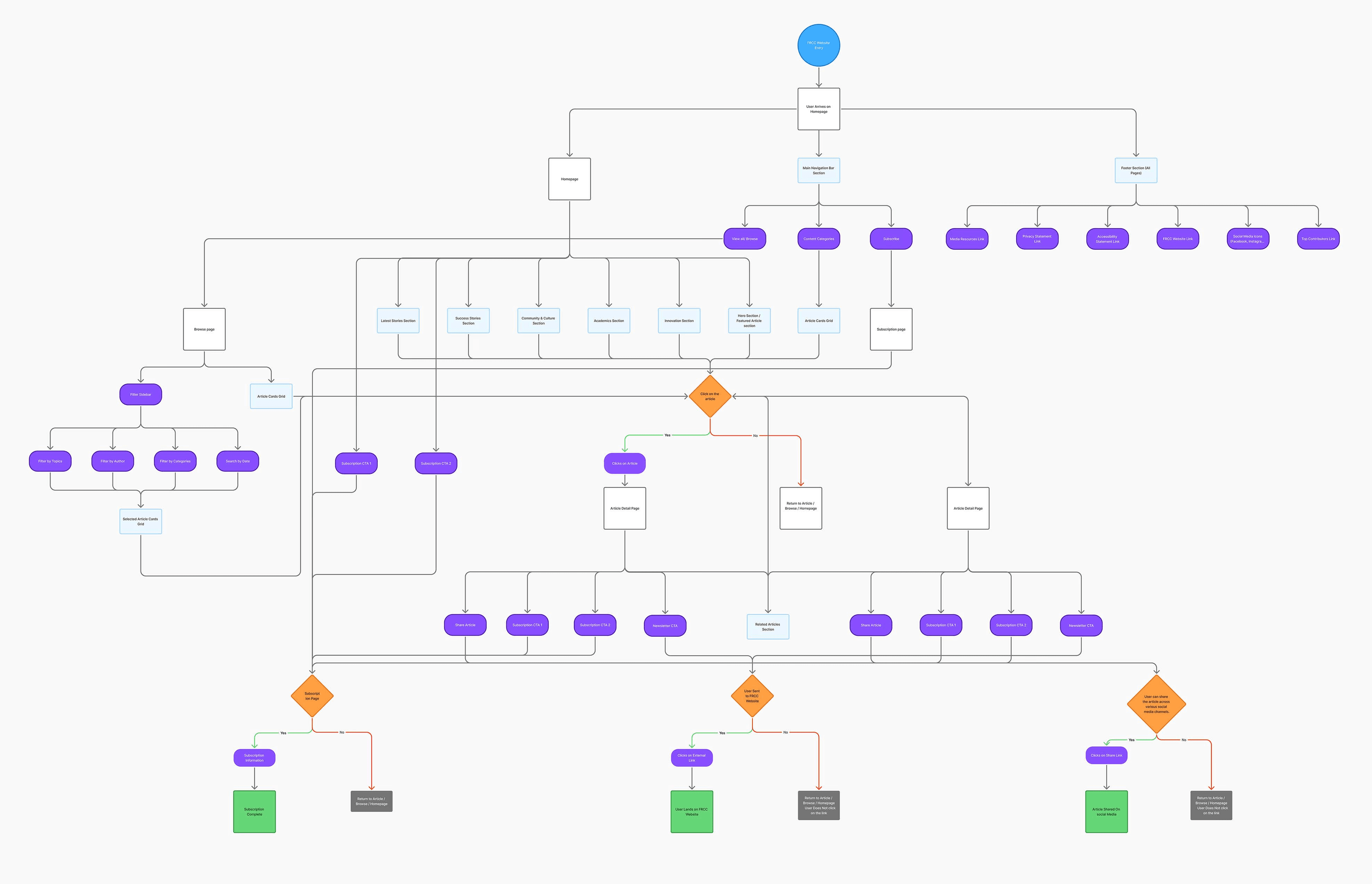
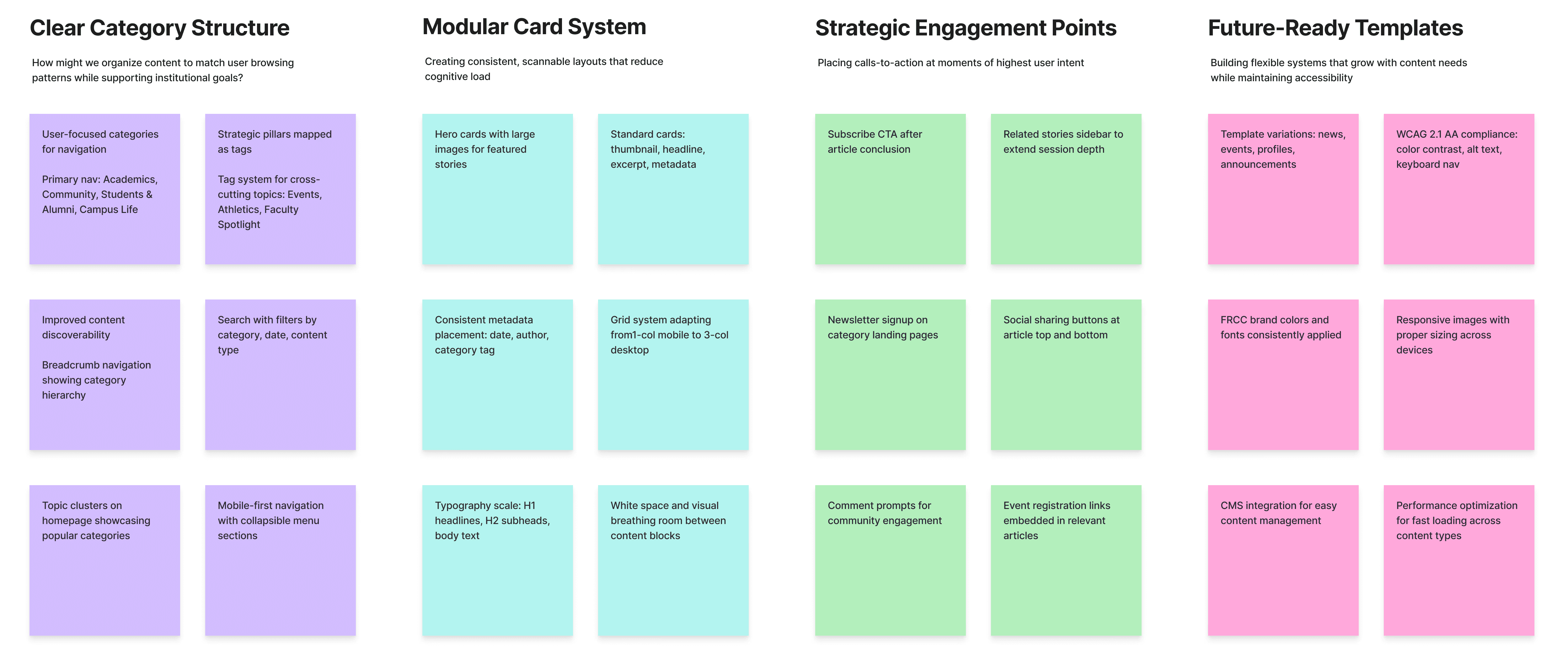
Navigation redesign: I refined the top navigation to include the main content areas (Top News, Academics, etc.) and ensured it remains consistent across all pages. Each major section now has its own category landing page (e.g., “Academics”), along with direct access to the main FRCC website, a dedicated Browse page, a Top Contributors page, a prominent site-wide search bar, and a “Subscribe Now” button placed in the header.
To reinforce conversions, I also added a second “Join our FRCC News newsletter” CTA at the bottom of listing pages—creating strong entry and exit points for subscription.
The Browse/View All page consolidates every article and includes robust filters for categories, tags, contributors, and date, making it easy for readers to explore content in multiple ways
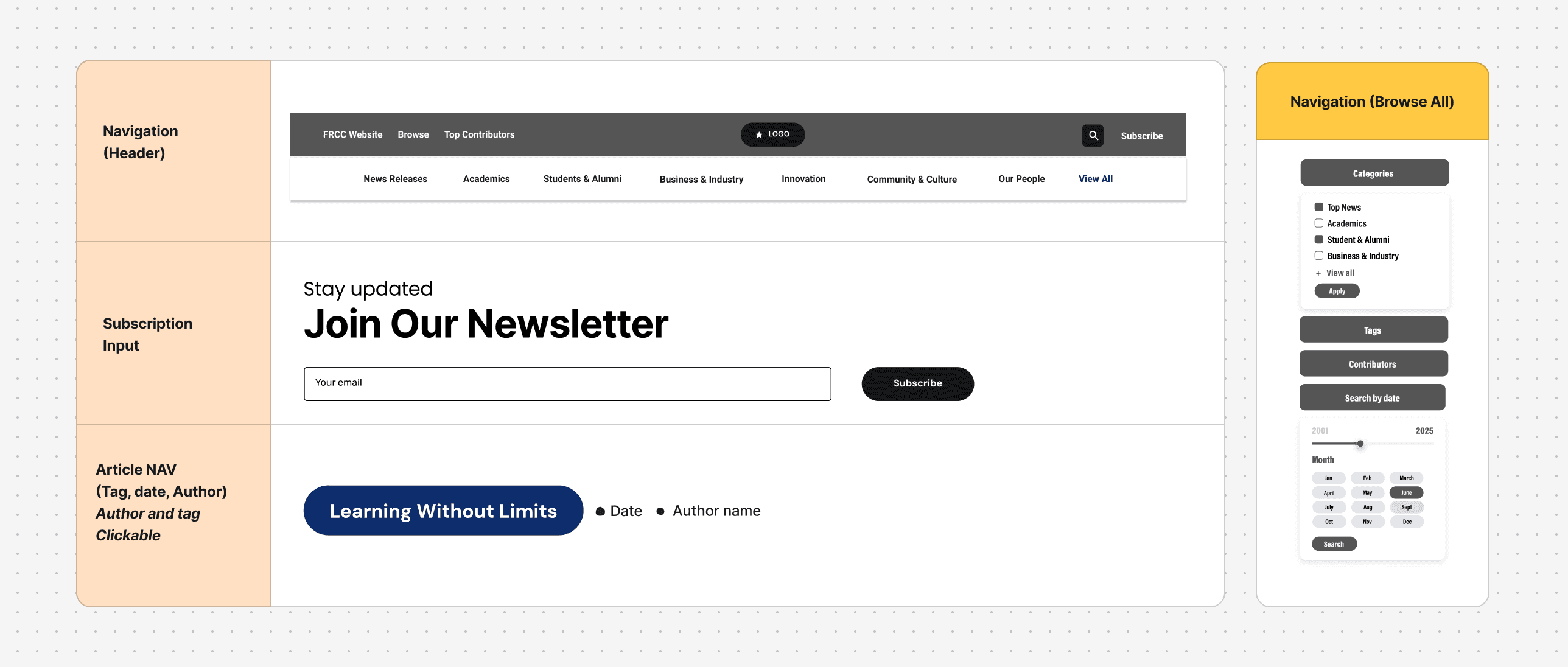
Foundational UX Structure: Navigation, Filters & Page Frameworks
I also planned new post categories with 2 wireframing options (“News,” “Announcements,” “Student Stories,” etc.) and set up an editorial calendar to ensure ongoing content across FRCC’s strategic pillars. Importantly, the site voice was made consistent: headlines now match FRCC’s brand tone.
Content strategy: I collaborated with the Content Specialist to define templates and guidelines. Each article includes a featured image, title, date, author, category tag– establishing hierarchy at a glance.
Overall, these updates created a campus-news magazine feel: bold visuals and modular sections tell a story at every scroll.
As one stakeholder noted in design review, “The new layout really feels like a professional news outlet now.”
Design Updates
During this phase, I conducted a full visual audit of the existing blog to understand how colors, typography, components, and layouts were being used—and where inconsistencies were creating friction. This inventory helped me define what the new system needed to standardize and scale.
I then created a refreshed FRCC News design system grounded in the college’s brand. It includes:
A unified color palette with accessible pairings
A clear typographic hierarchy using Acumin Pro Condensed for all headings and UI text
A full set of CTA button styles for primary, secondary, and inline actions
A flexible grid system supporting 1-, 2-, and 4-column layouts
Reusable modules for highlighted sections, media blocks, and newsletter banners
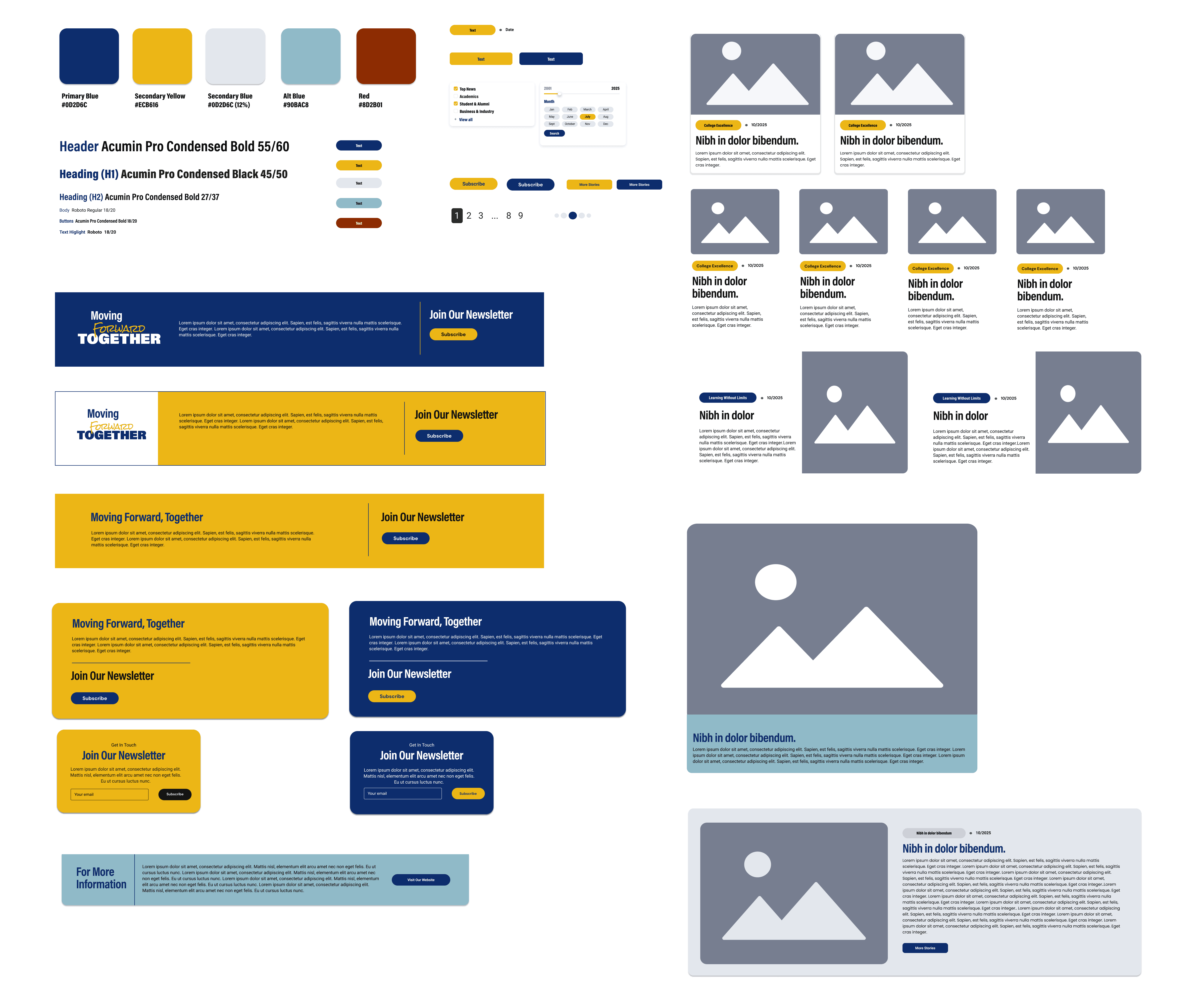
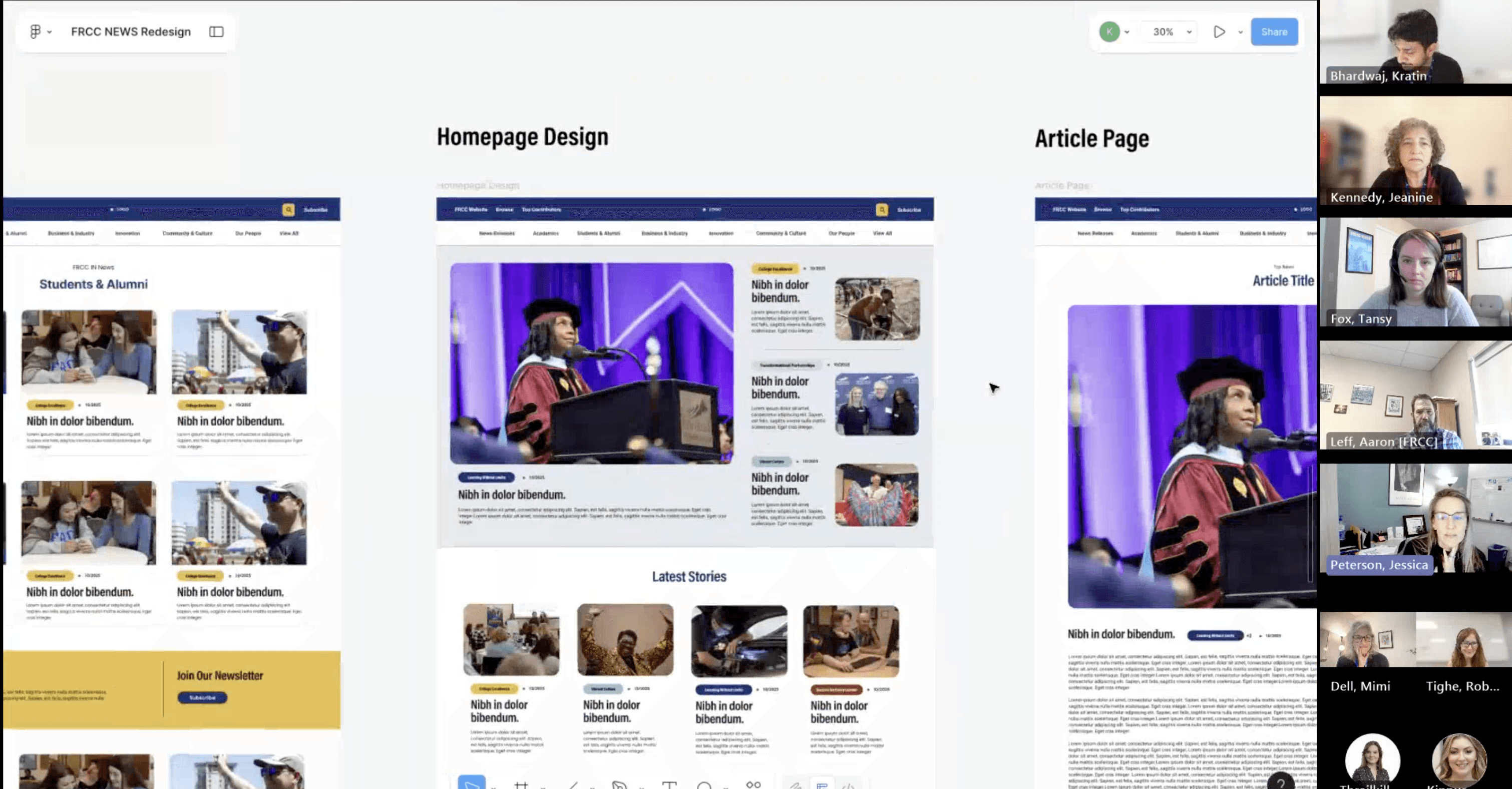
At the UI level, I introduced a modular card system used across all listing pages. Each card displays the article image, headline, metadata (date, author, category), and an excerpt. This consistent structure makes scanning effortless and creates a cohesive visual rhythm throughout the site.
Accessibility was built in from the start: all colors meet WCAG AA contrast standards, all images should include alt text, focus states are clearly visible, and every template is fully responsive. The final visual language is clean, modern, and spacious—bringing clarity to the content while staying true to FRCC’s brand identity.
Final Redesign
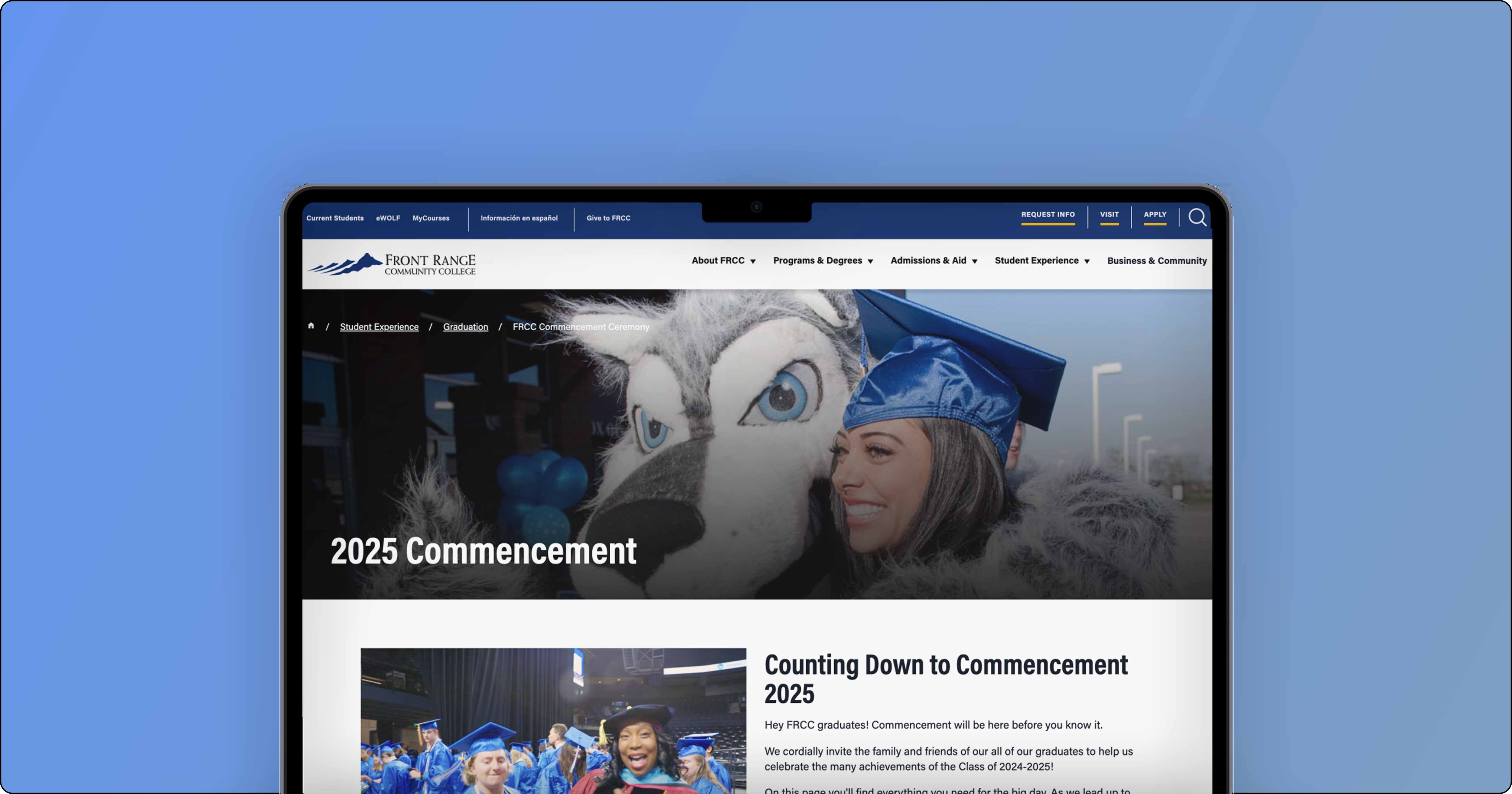
Bringing the new FRCC News experience to life
With the strategy, IA, and design system in place, I translated the work into a fully responsive interface across desktop and mobile. The goal was to create a reading experience that feels structured, modern, and effortless—regardless of device.
Desktop Experience
On desktop, the layout emphasizes clarity and exploration:
A persistent top navigation anchored by user-facing categories
A flexible grid that adapts from featured hero stories to standard cards
Clear metadata patterns (tags, date, author) that help users orient quickly
A redesigned article template with improved typography, generous spacing, and strong CTAs
Related stories and share actions placed where engagement is most natural
The desktop design showcases the full power of the modular system—every component snaps into the grid cleanly, making the interface feel consistent and intuitive.
Mobile Experience
The mobile design prioritizes speed, readability, and thumb-friendly interaction. Instead of infinite scrolling, I introduced structured sections and collapsible menus that make navigating long pages easier. Key improvements include:
A simplified mobile nav with clear category access
Scannable card layouts that maintain hierarchy even at small sizes
Improved article readability through larger line heights and tighter spacing rules
Sticky actions (share, subscribe) placed where mobile users naturally pause
Tap-friendly filter and tag interactions on browse pages
The mobile experience mirrors the desktop principles while optimizing for on-the-go reading and discovery.
Before finalizing the redesign, I ran moderated usability sessions and click-through testing on the high-fidelity prototype. The goal was to validate core UX decisions—navigation, hierarchy, discoverability, and comprehension—before engineering investment.
Key Findings
Navigation comprehension improved
92% of users correctly understood each top-level category (vs. ~40% previously).
Users clearly distinguished Categories (content topics) from Tags (strategic themes).
Search & filtering became intuitive
86% successfully refined results using filters (up from 22%).
Users preferred tag-based exploration over month archives—describing it as “more relevant” and “easier to browse.”
Stronger article readability & structure
7 of 8 participants scrolled deeper than in the old layout.
Full-width reading and improved typography increased perceived trust and professionalism.
Subscription CTA placement validated
No participants mistook the mid-article CTA as the end of the page.
Many described the CTA as “natural” and “not overwhelming.”
5 of 8 said they would likely subscribe from that location.
Contributor pages increased trust
All participants said author bios improved credibility.
Several naturally clicked the author name after reading stories they liked.
Prototype Success Metrics
Validated through moderated testing and click-tracking:
Task success rate: 91% (up from 54%)
Time to find a relevant article: ↓ ~70%
“Dead ends” reported: near zero
Navigation misclicks: ↓ 60%
Ease-of-use rating: 4.4 / 5
Implications for Development
Testing confirmed that:
The new IA was clear, intuitive, and aligned with how users think.
The dual-navigation model (Categories + Pillar Tags) served both audience needs and FRCC’s strategic themes.
The design system reduced cognitive load and created visual consistency.
The flow naturally supported all key business outcomes:
discover content → stay longer → subscribe.
User Feedback
Personal Takeaway
This project reinforced the critical importance of leading with empathy and data. The most impactful improvements came not from adding complexity, but from ruthlessly simplifying the experience around core user needs. Seeing measurable improvements in user satisfaction while simultaneously reducing cognitive load demonstrated that thoughtful constraint breeds innovation.
Perhaps most importantly: great design makes itself invisible. The success of this redesign wasn't that users noticed the new interface — it was that they stopped noticing the interface at all, allowing them to focus entirely on the content.